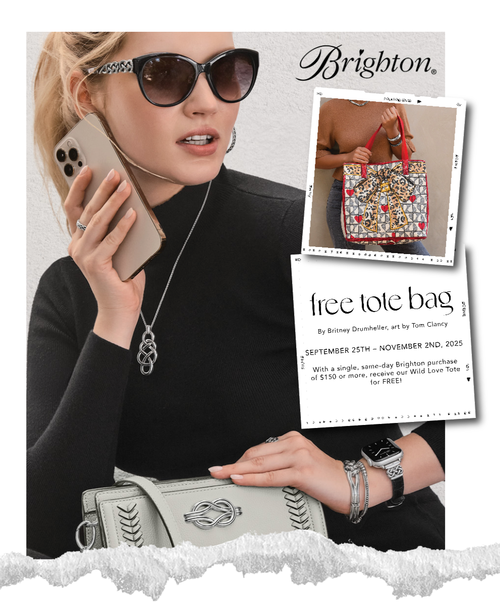
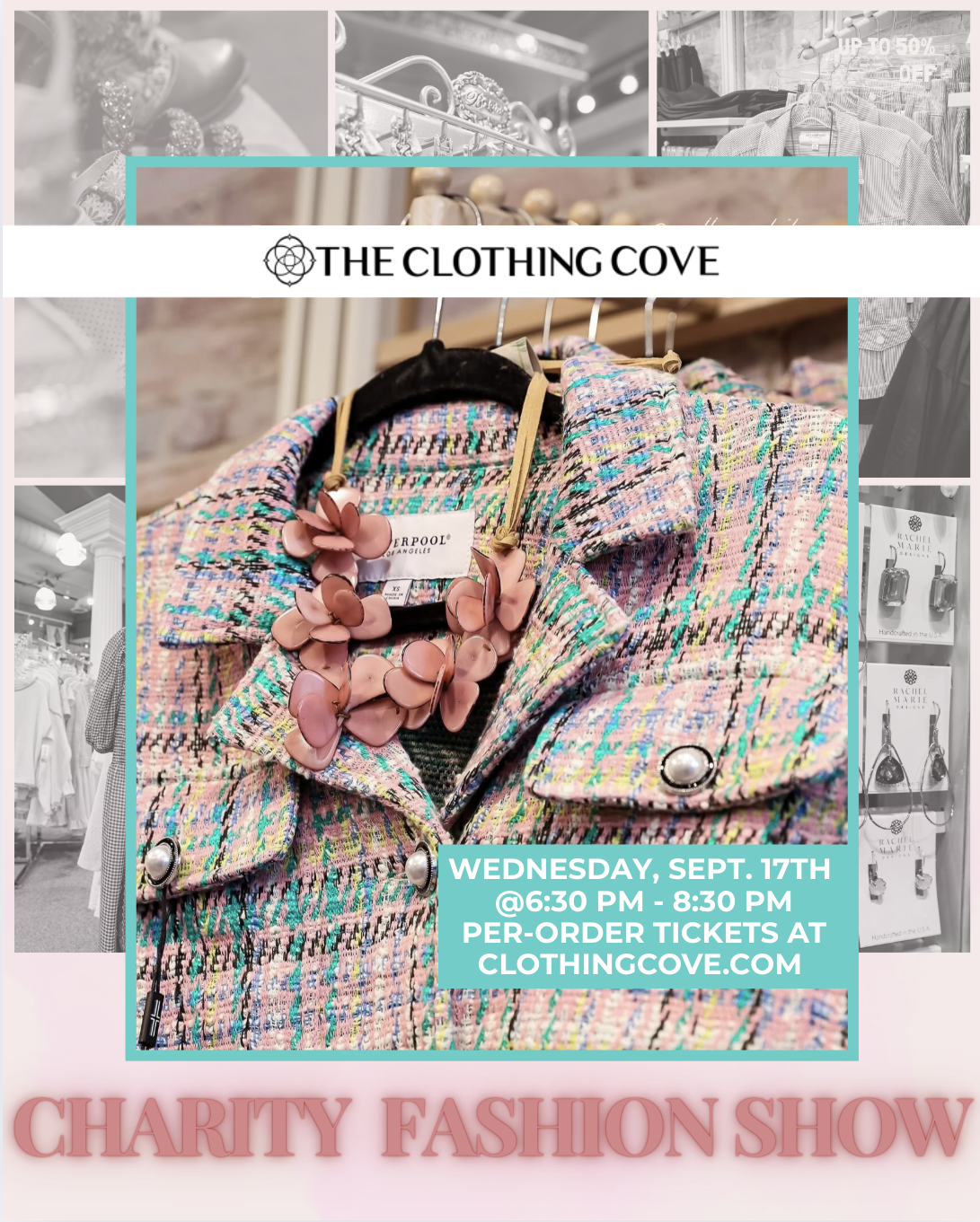
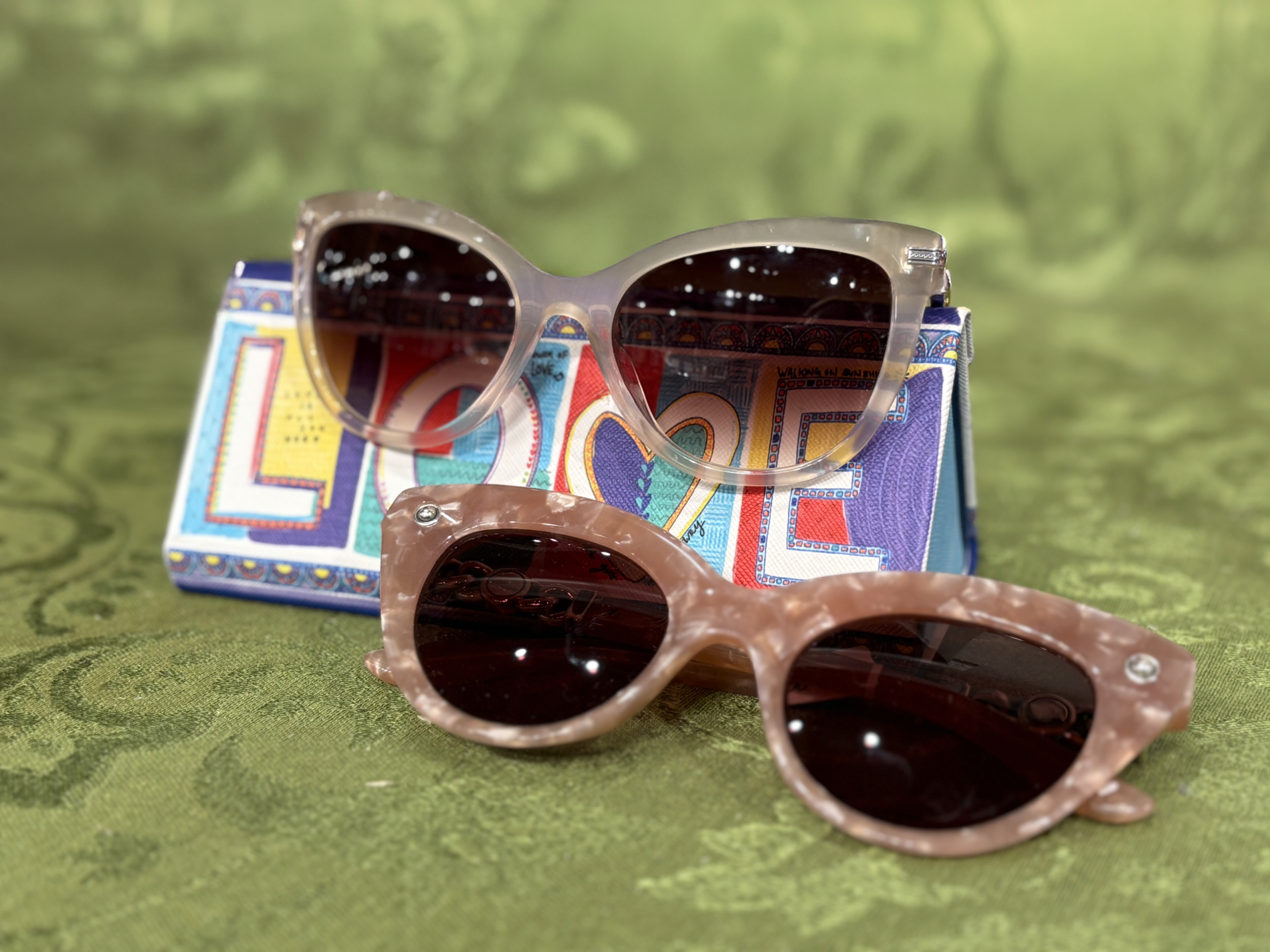
Digital Marketing & Social Media Design
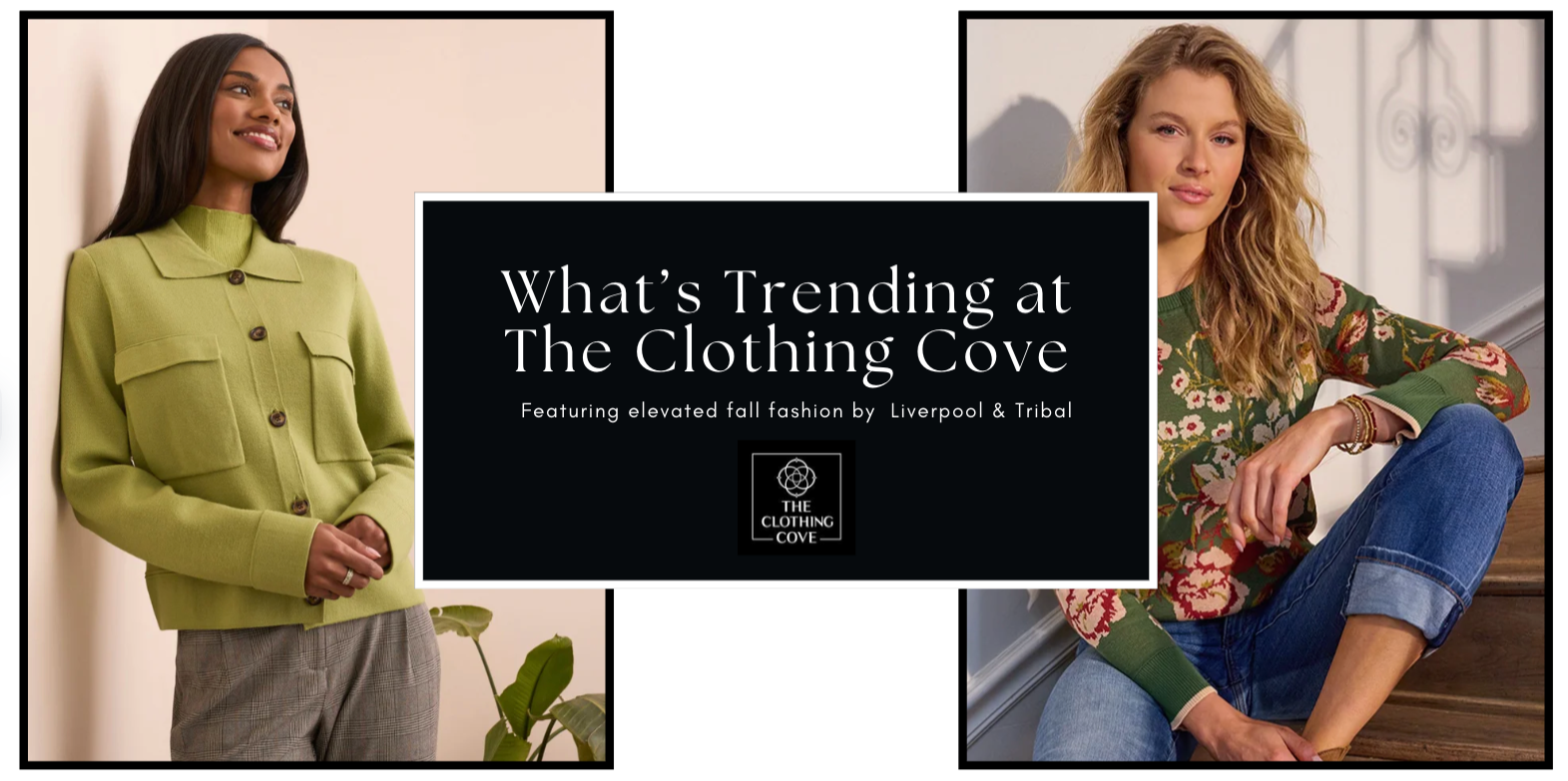
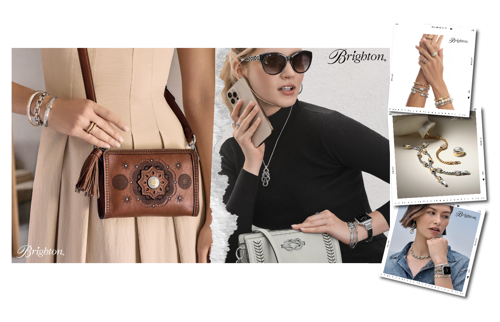
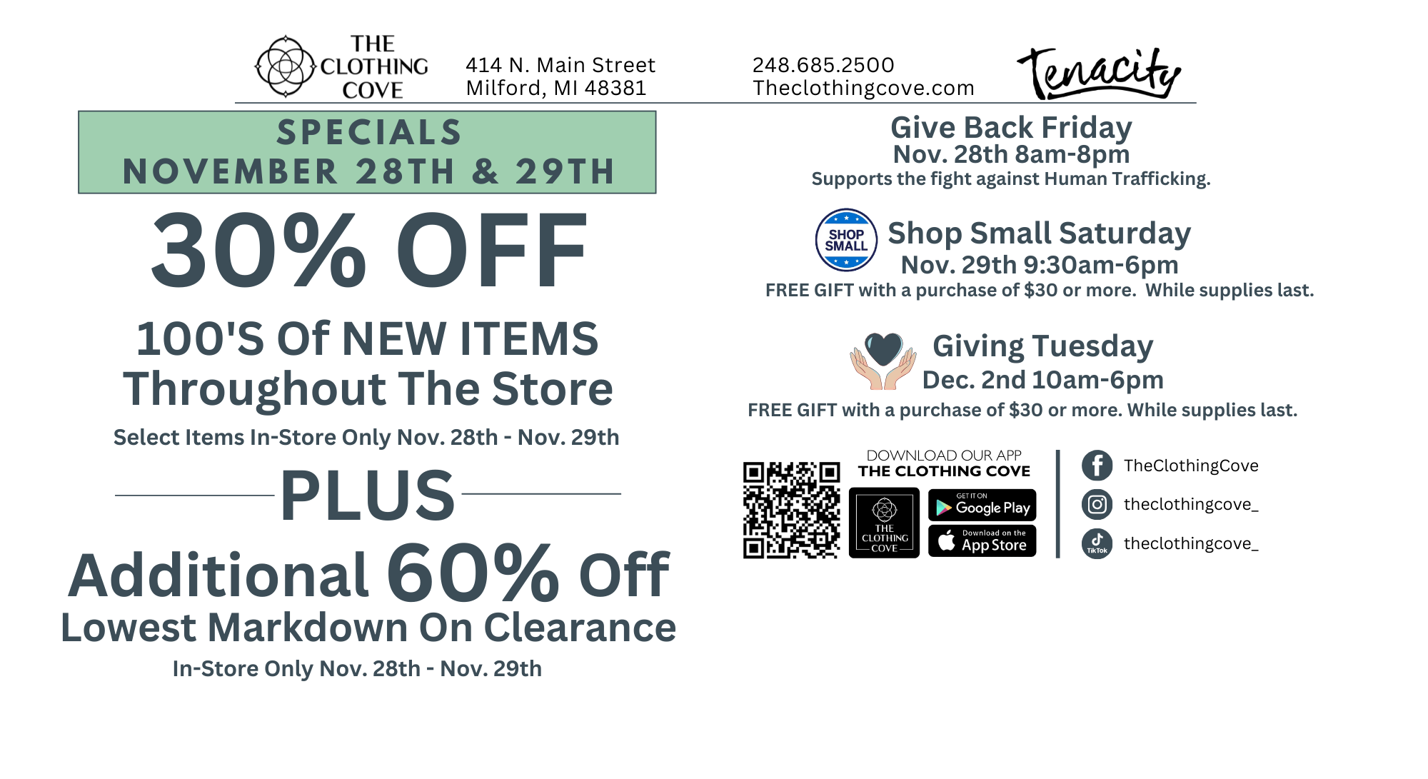
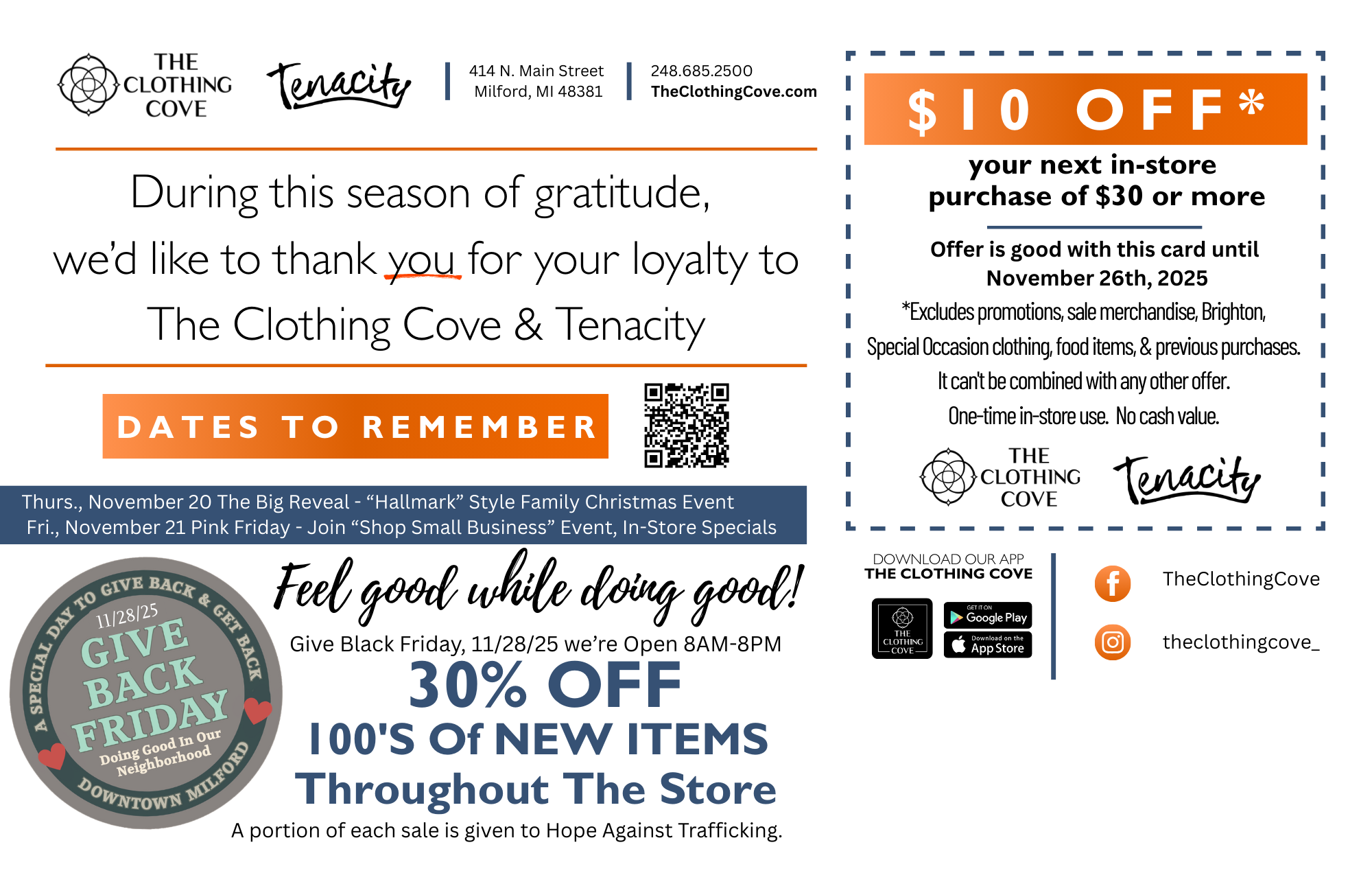
The Clothing Cove – Milford, MI
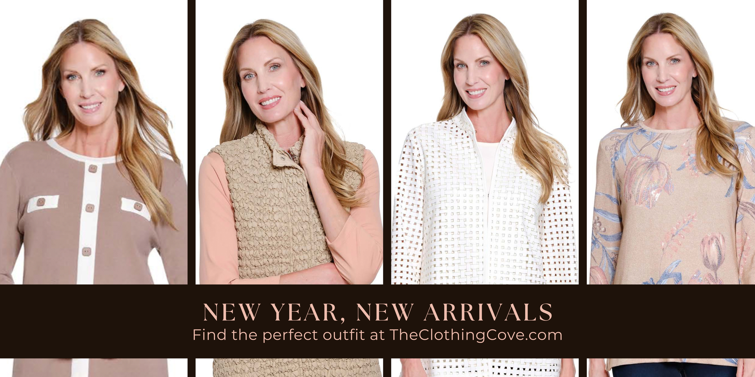
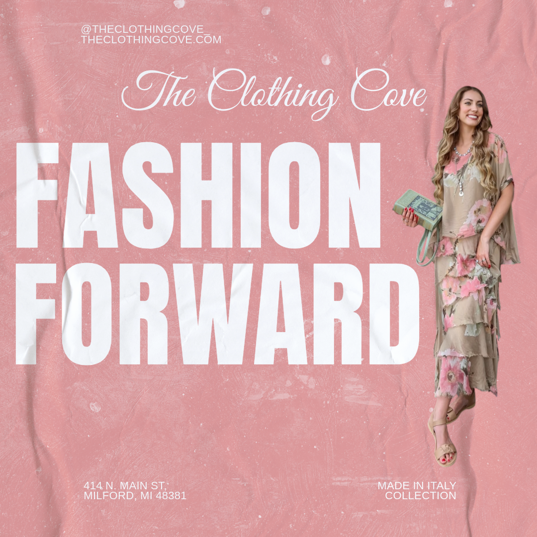
As the Social and Digital Marketing lead for The Clothing Cove in Milford, Michigan, I develop and execute engaging content that strengthens brand identity and connects with the local community. My role includes social media strategy, digital content creation, graphic design, website updates, and promotion of in-store collections and events. Through cohesive visual storytelling and strategic marketing, I help elevate the brand’s online presence and drive meaningful customer engagement.


Branding & Product Development
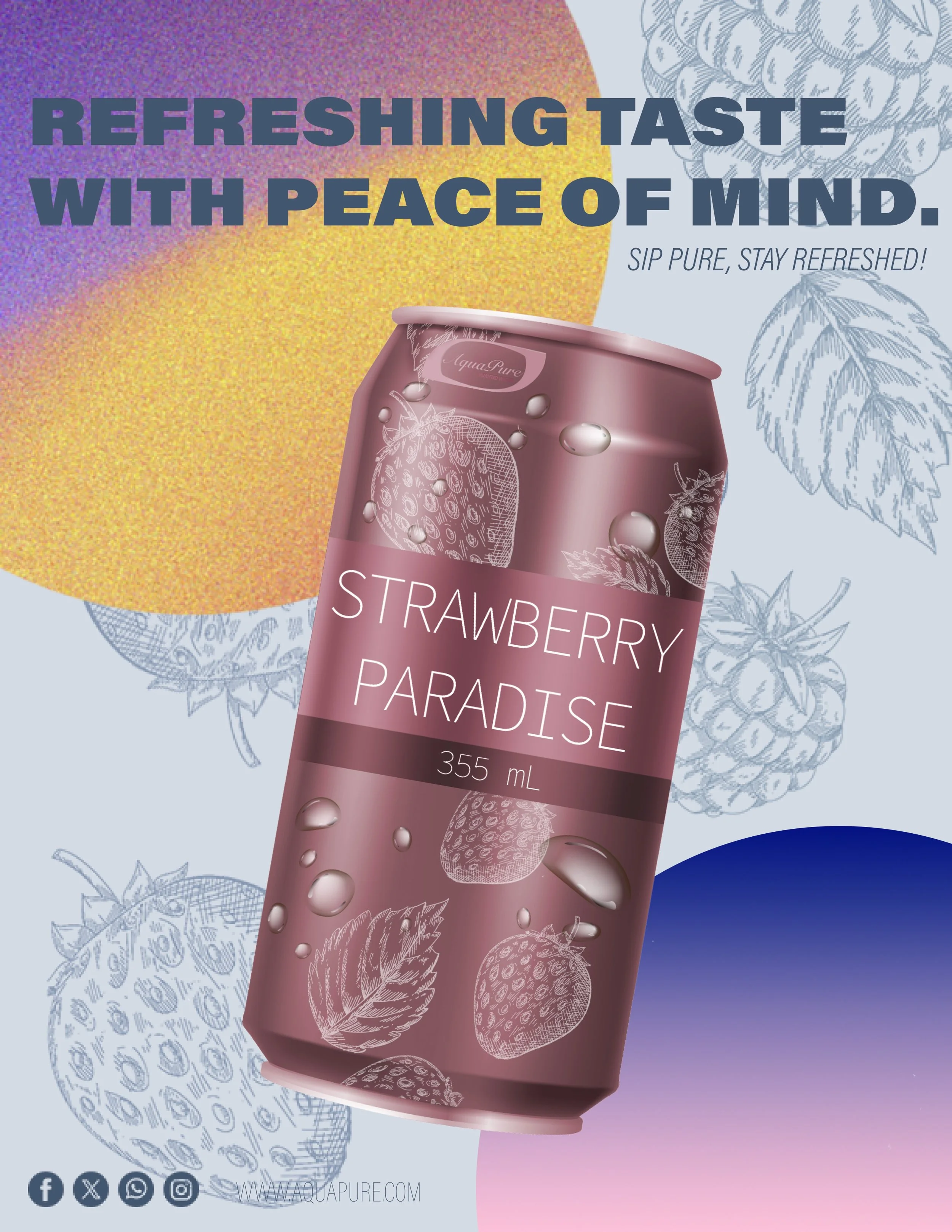
Introducing AquaPure's Flavored Canned Water


Experience refreshment like never before with our new naturally flavored cans — pure, crisp, and crafted for every moment.
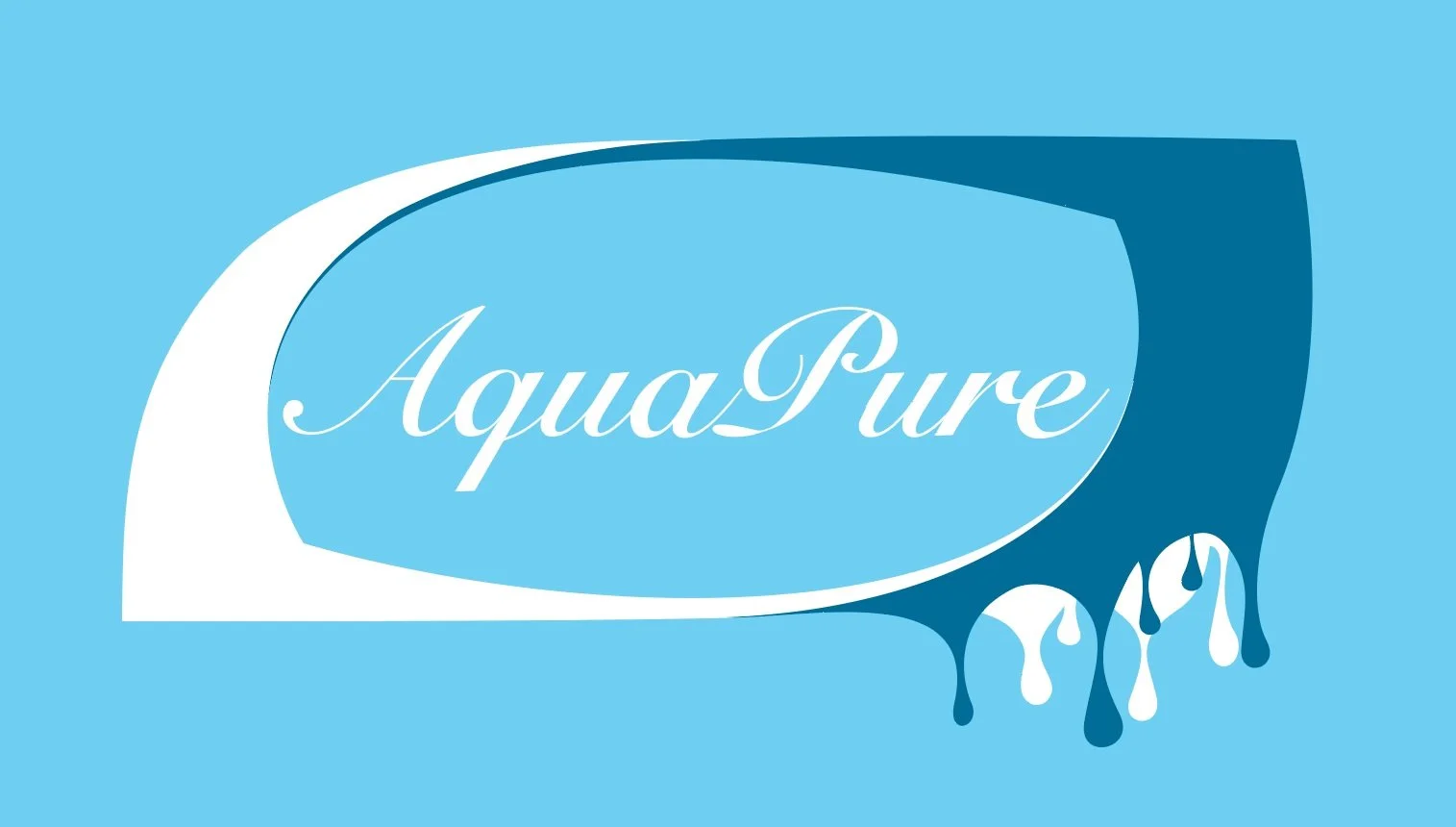
AquaPure - Identity Design Course Project (GD 466)
In my Identity Design course (GD 466) at Michigan State University, I had the opportunity to develop a brand identity from the ground up. Given the freedom to create a new business or rebrand an existing one, I conceptualized Aquapure, a sustainable water bottle company dedicated to providing high-quality, purified water while prioritizing environmental responsibility.
Aquapure was set to be founded in the early 2000s with the mission of improving the lives of its customers and reducing plastic waste. Unlike traditional bottled water brands, Aquapure uses 100% recycled materials—primarily polyethylene terephthalate (PET) and High-Density Polyethylene (HDPE)—to manufacture its bottles, ensuring durability, safety, and environmental sustainability. These materials are resistant to chemicals, acids, detergents, and cleaning solutions, making them the ideal choice for long-term food and beverage storage.
By focusing on sustainability, Aquapure aims to increase the recycling rate of PET plastics, which currently stands at 29.1% according to the EPA. Over the past 10 to 12 years, the company has transitioned to using 100% recycled materials, making its bottles lightweight, reusable, and easy to recycle. With a range of purified and flavored water options, Aquapure seeks to offer a convenient, eco-friendly alternative to aluminum and glass packaging.


Business Card - Front
Business Card - Back

The Initial Branding Assets Include:
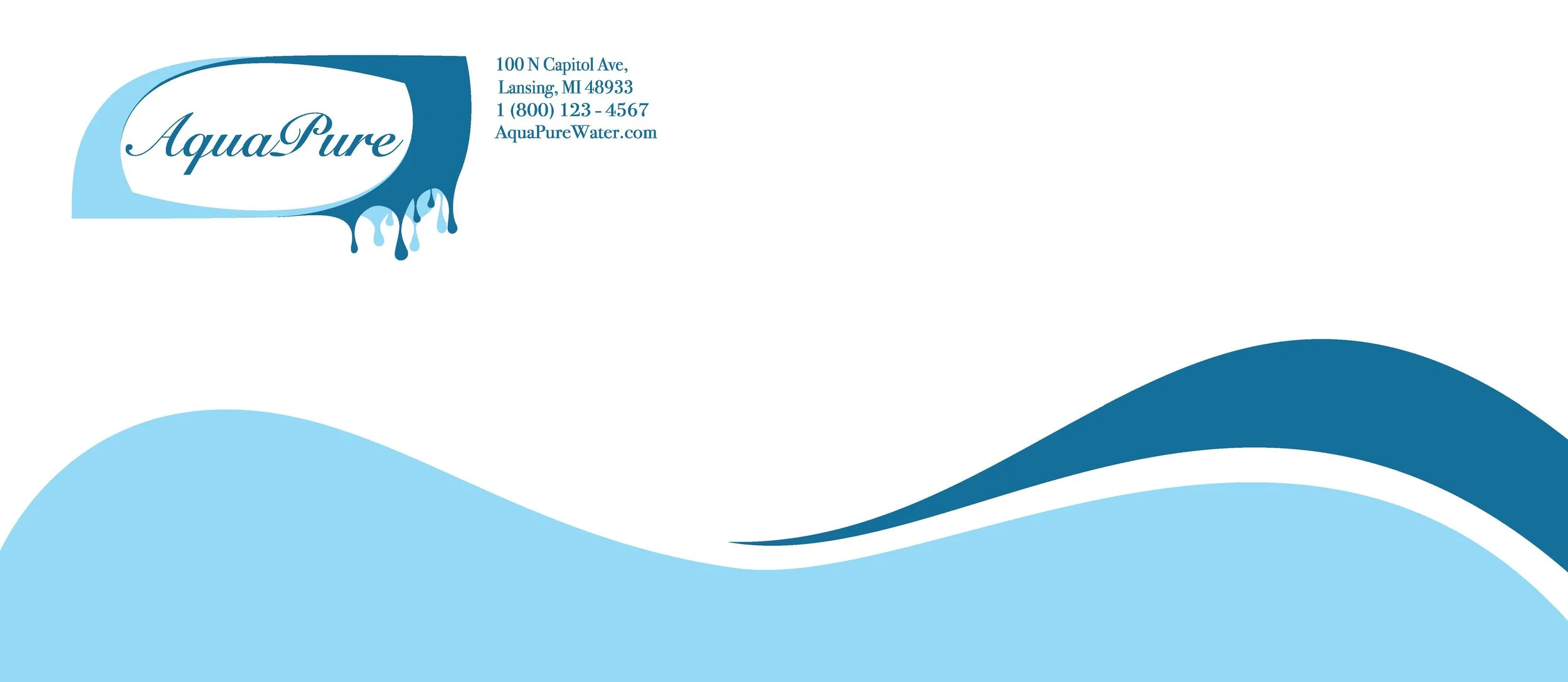
Business Letterhead
Business Card
Envelope Design
Logo
As the class progressed, I conducted in-depth research into branding, consumer trust, and sustainable packaging, allowing me to refine the visual and conceptual elements of Aquapure. The identity design extended to:
Brochure Design – Educating consumers about Aquapure’s mission, sustainability efforts, and product benefits.
Print & Digital Advertisements – Including posters, billboards, and online promotional designs to establish brand awareness.
Website Homepage Design – A visually engaging online presence to introduce Aquapure’s mission and product offerings.

Product Design & Revision Process
One of the key components of this project was product packaging design, which I initially created using mockups. However, after further refinement and critique, I redesigned the packaging to align with the brand’s aesthetics and values. This revision demonstrates my ability to critically evaluate my work, apply constructive feedback, and enhance the outcome to ensure consistency across all branding materials.
Beyond the Product – Community Engagement & Sustainability Efforts
Aquapure isn’t just a product—it’s a movement. In addition to its commitment to sustainable packaging, the brand fosters environmental consciousness through:
Community Clean-up Initiatives – Encouraging customers and volunteers to participate in reducing plastic waste.
Social Media Engagement – Raising awareness about sustainability, recycling, and responsible consumption.
Partnerships with Local Organizations – Collaborating with eco-friendly initiatives to make a greater impact.
In promoting this conceptualized brand, choosing Aquapure means more than just purchasing water—it’s about supporting a company prioritizing integrity, sustainability, and a healthier planet.
-
![]()
Envelope - Front
-
![]()
Envelope - Back
-
![]()
Letterhead


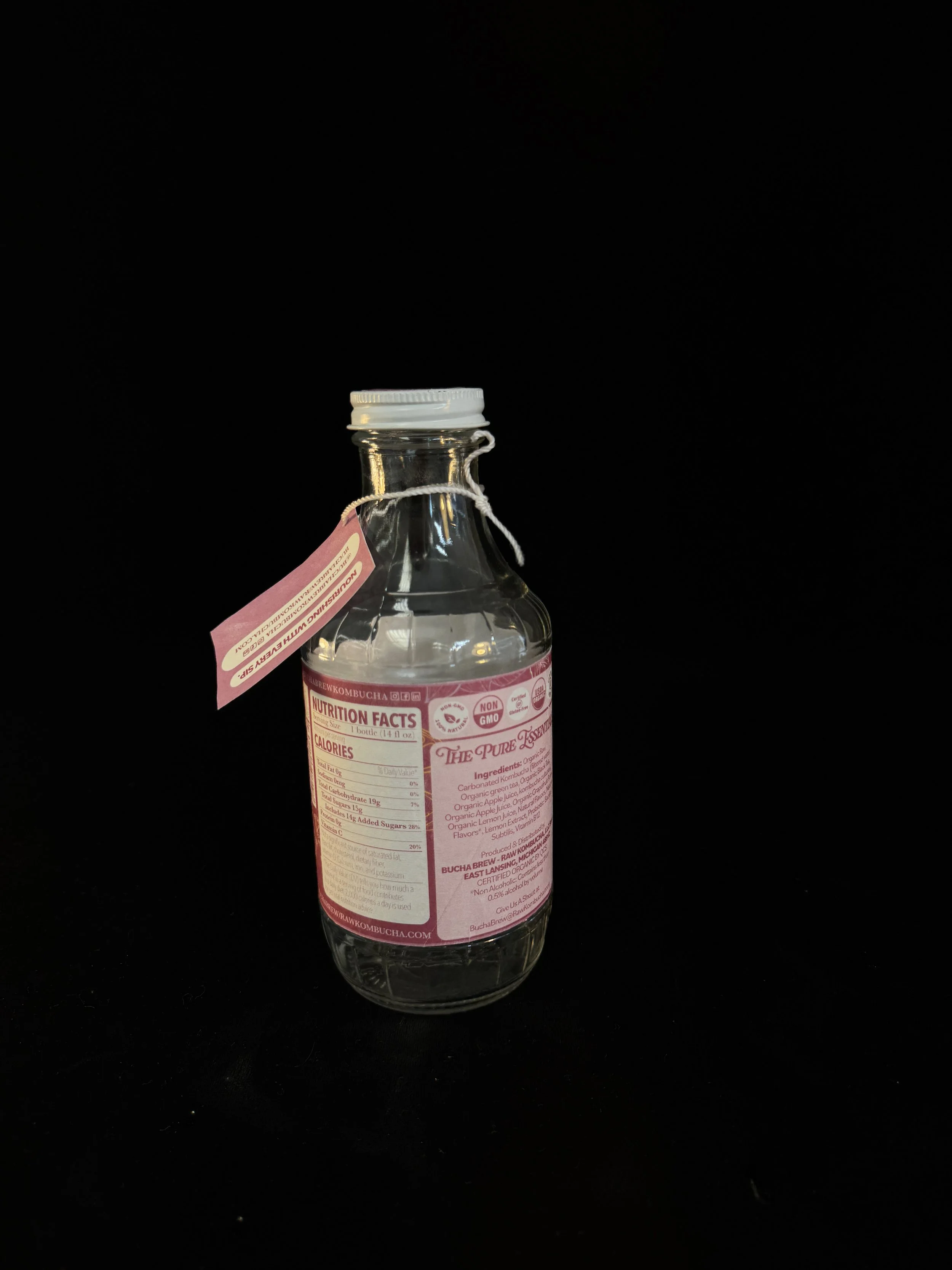
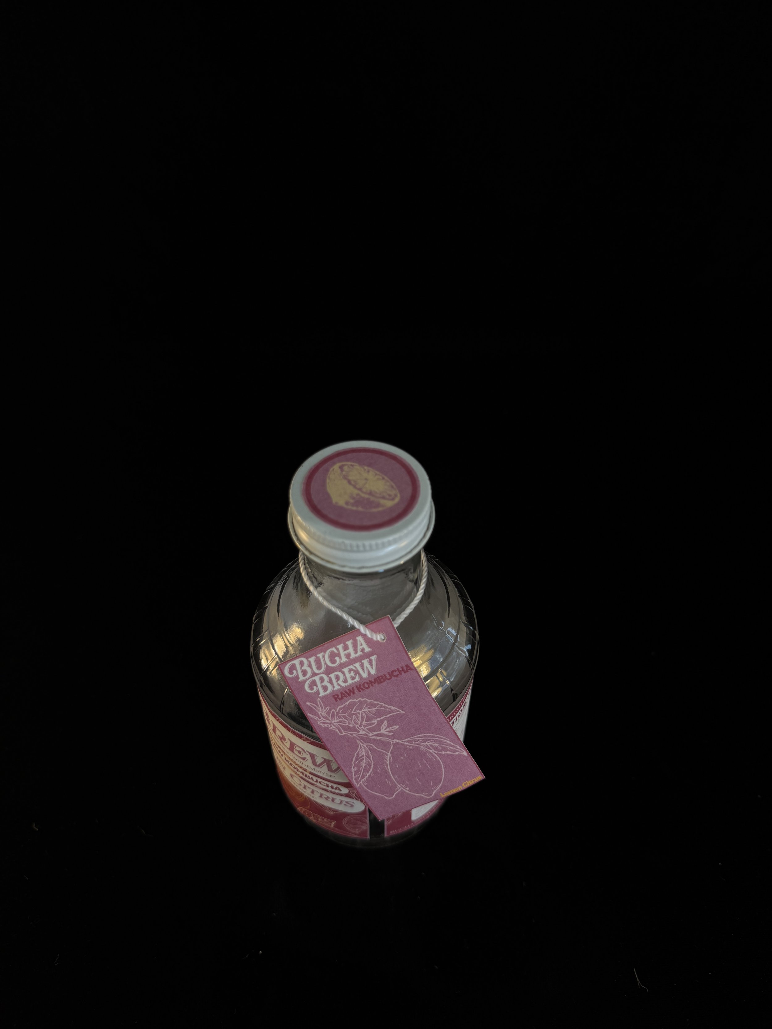
Bucha Brew
Sustainable Refillable Glass Bottle Design
Exploration of Surface, Volume, and Materiality
Reduce / Reuse / Recycle > Reimage / Revive / Rebalance.
This project was an in-depth investigation into the integration of materiality and design within a practical 3D form, using surface and volume as tools of communication. The assignment required a thoughtful balance between glass's inherent qualities and surface design's expressive potential. I chose to repurpose an antique glass bottle as the foundation for a sustainable, refillable beverage packaging system intended for use at local, homegrown grocery stores.
Glass, as my primary material, offered natural transparency, tactile coolness, and subtle color variations that I used to guide the palette and overall aesthetic. Rather than covering or disguising these characteristics, I leaned into them, designing a system that embraced the natural tones and textures of the glass, including the play between transparency and opacity.
To address adaptability and personalization, I introduced a secondary material: a waterproof, interchangeable tag that clips onto the bottle. This tag serves both a practical and aesthetic function—communicating flavor, brand identity, and contributing to the user’s interaction with the object. Its material ensures durability through repeated use and cleaning, reinforcing the concept of longevity and sustainability.
The visual identity and surface design evolved from extensive thumbnail explorations (40+ variations), where I considered form, negative space, repetition, and asymmetrical balance. My final designs utilize a minimal graphic system, contrasting organic bottle shapes with geometric design elements. Grid systems helped align text and design with the bottle's unique curvature and tactile surfaces, creating a cohesive and considered visual language.
Responding to critique from the first round of reviews, I refined the branding to be more legible and visually engaging, adding a second flavor variation to expand the system and show progression. These updates not only improved visual clarity but also demonstrated the flexibility of the design system across different iterations.
This project exemplifies thoughtful design rooted in environmental awareness, material honesty, and user interaction, balancing aesthetics with functionality. Every detail, from surface texture to tag material, was chosen to support the product’s life cycle, enhance the user’s experience, and emphasize a sustainable lifestyle.


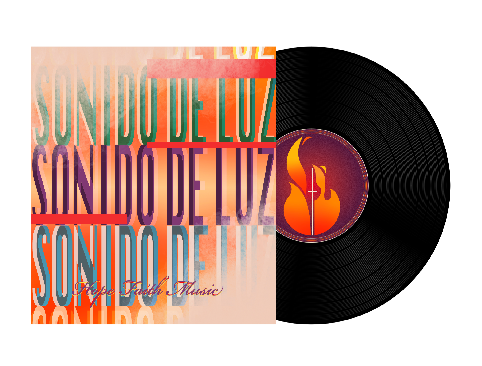
Sonido De Luz
“Sound of Light”
I had the opportunity to create a new logo and rebrand for a church ministry based in Honduras called Sonido de Luz. By working closely with the client, I drew inspiration from the original logo, considering elements like color, shape, and typography, and incorporating their vision for the brand’s future. The result was a visually compelling and creative design that is eye-catching and deeply representative of the ministry’s identity and mission.


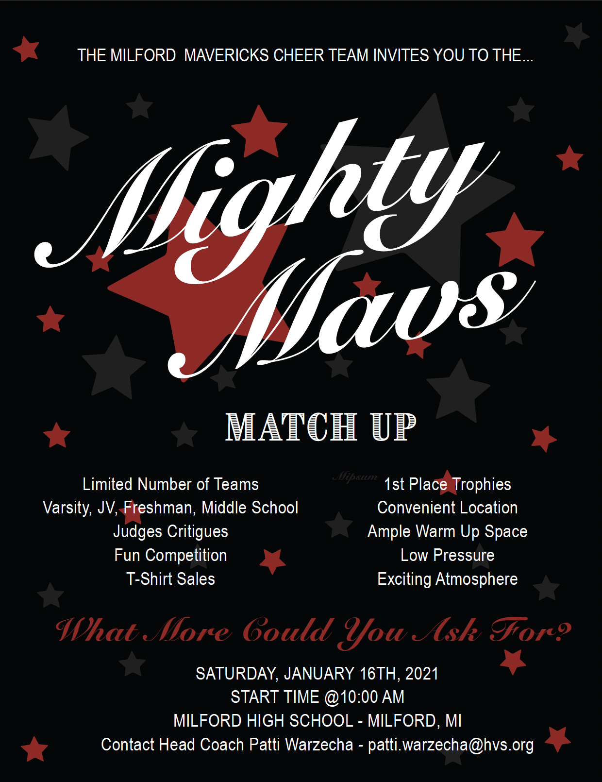
Creative Roots in Community-Driven Projects

From high school onward, I’ve collaborated with local teams, clubs, and nonprofit organizations to create impactful designs that tell a story and serve a purpose. These early projects sharpened my communication skills, strengthened my design intuition, and shaped my passion for using creativity to support others. Each project was a step toward becoming the designer I am today — committed, empathetic, and always evolving.
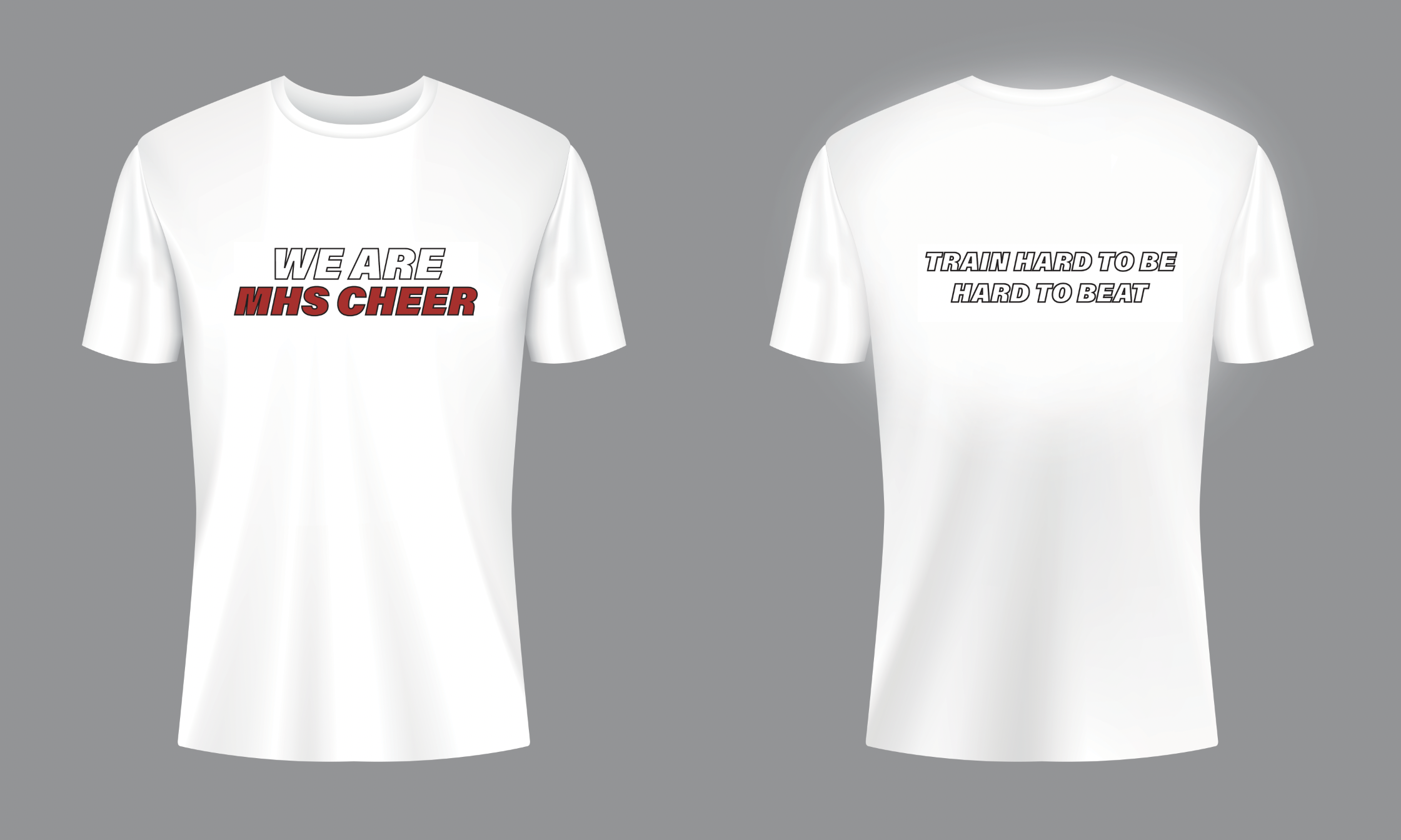
Shirt Design


Invitations & Social Media Content