Environmental System

This project was a collaborative effort between Brooke Gollan and Reegan Loveland.
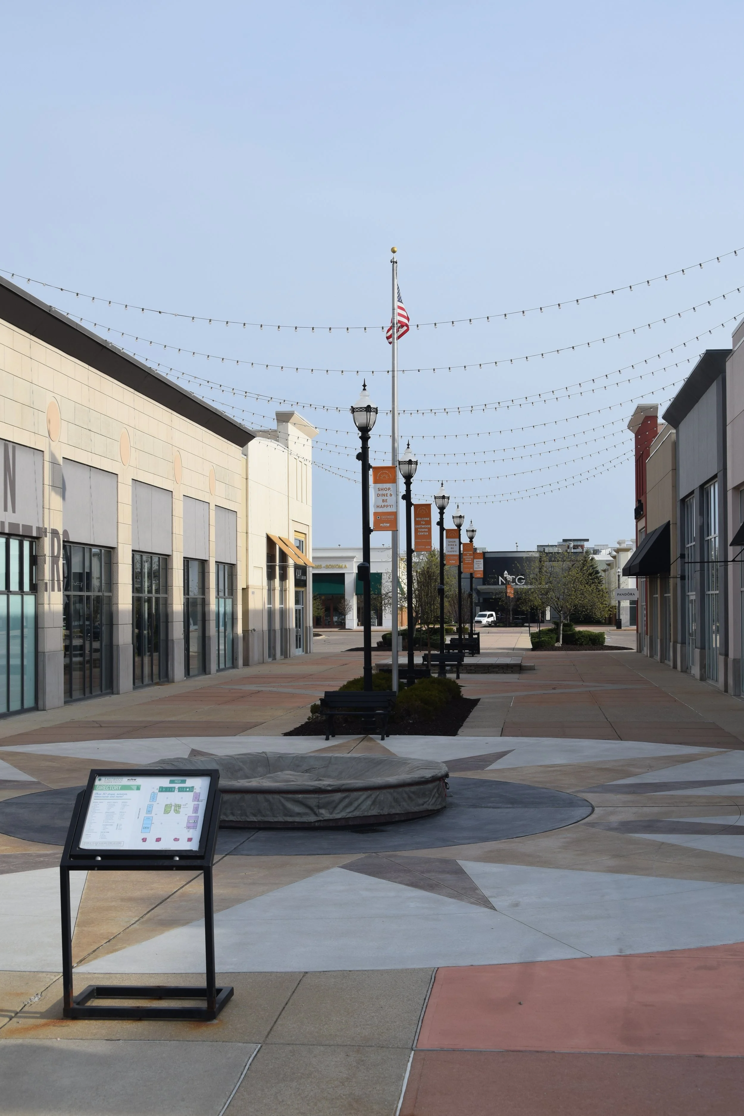
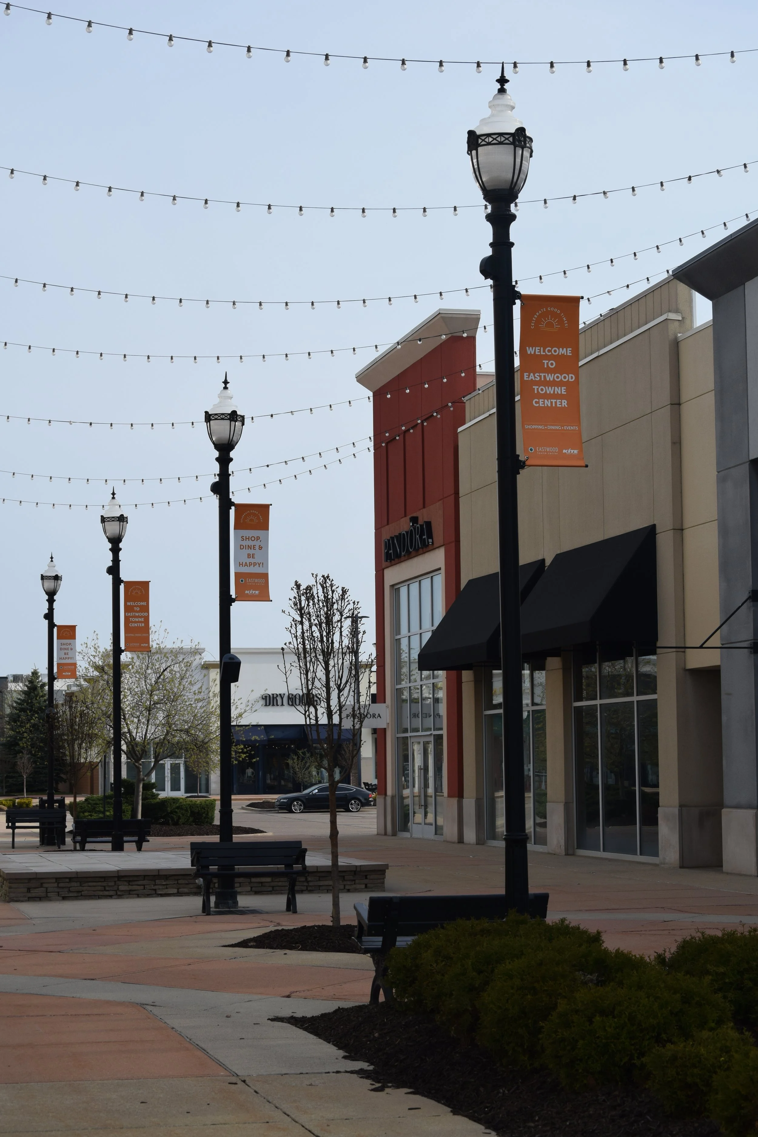
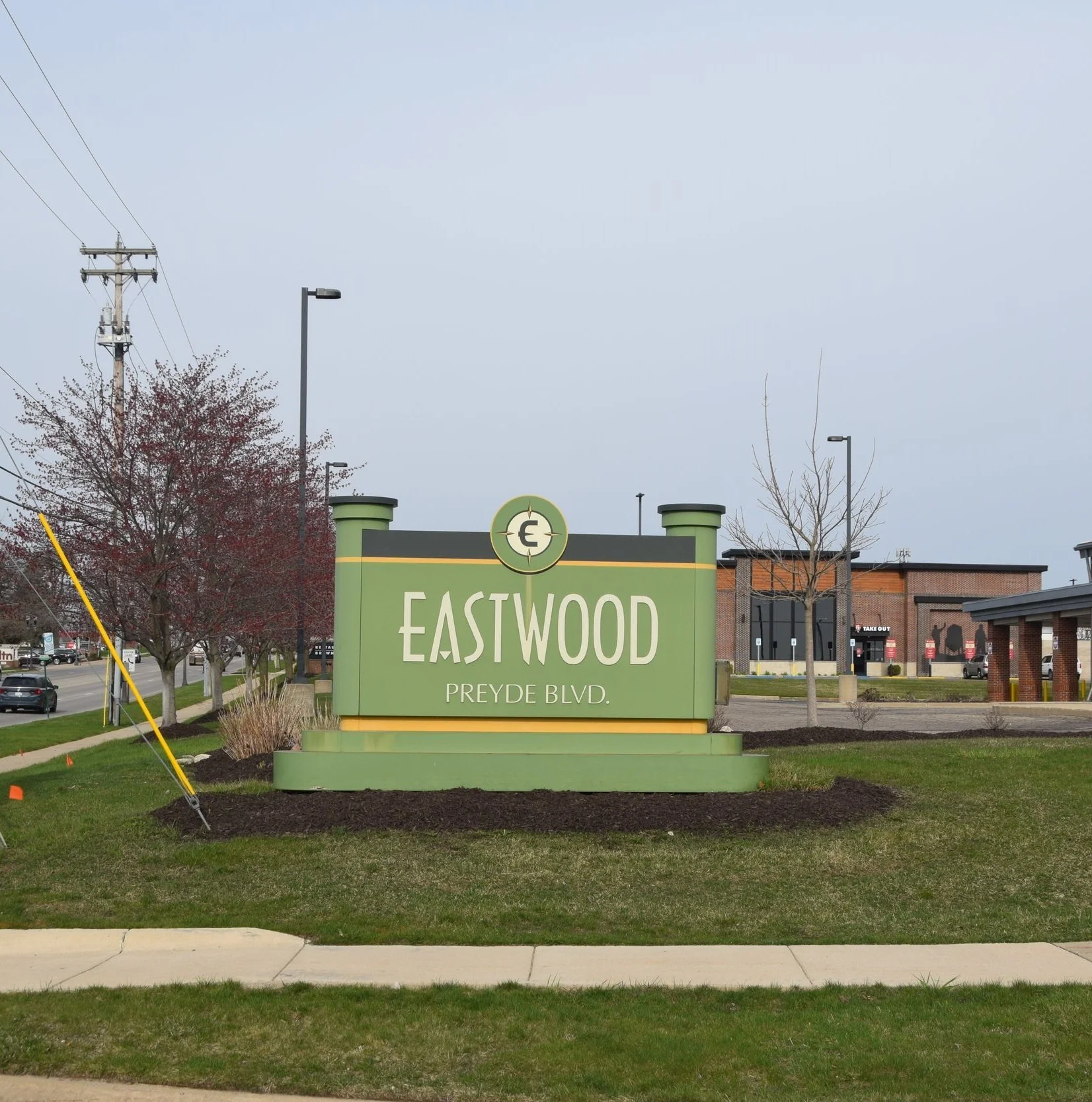
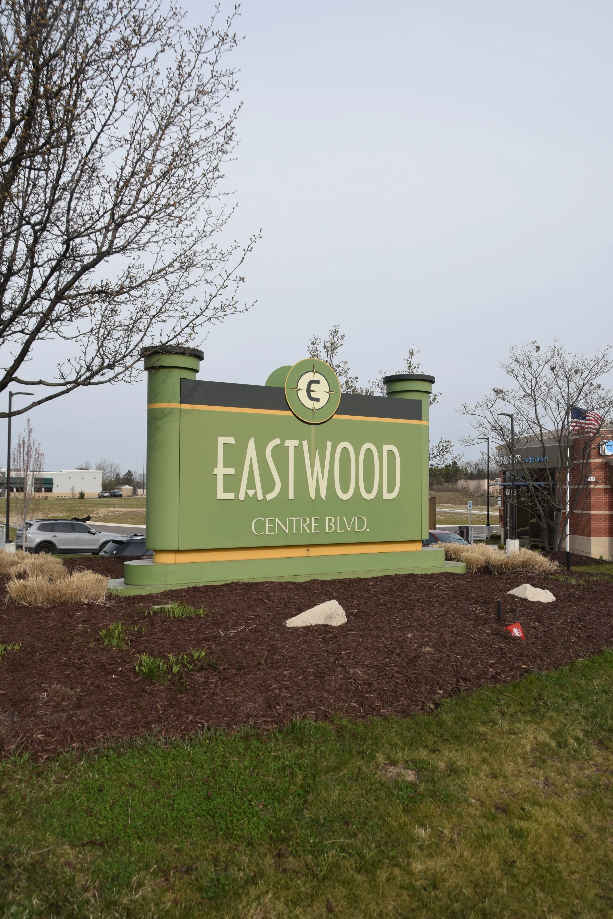
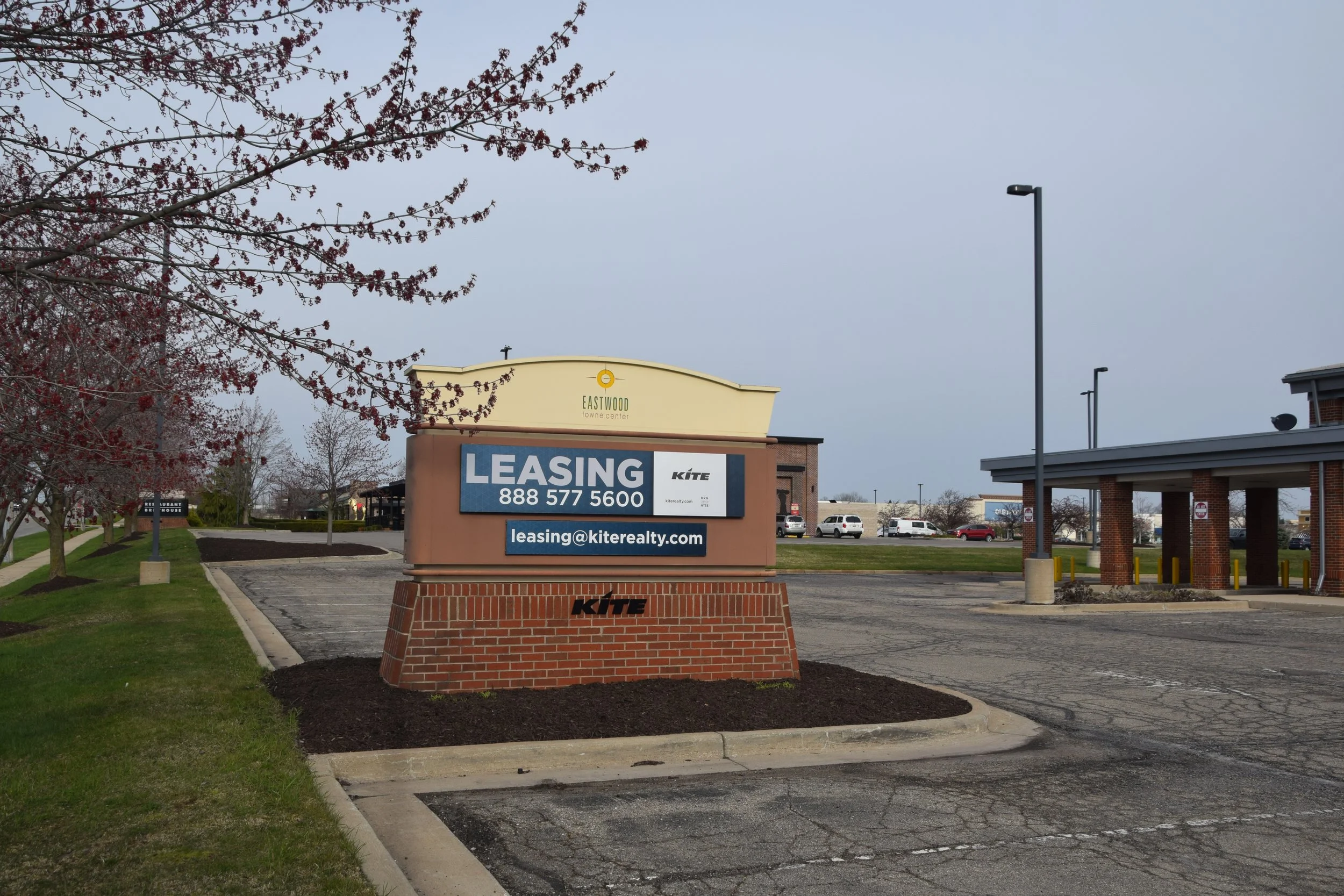
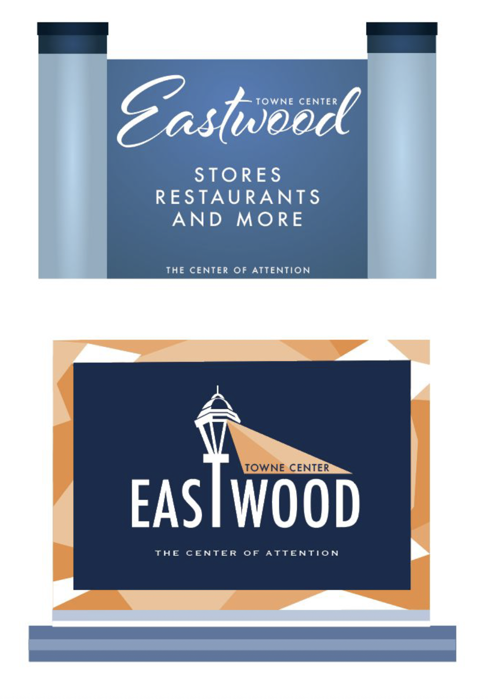
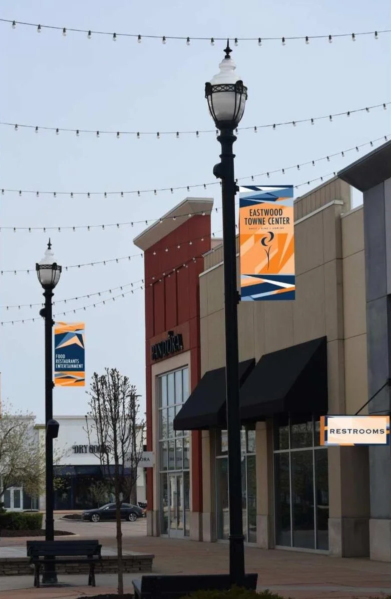
Eastwood Towne Center is an outlet mall that offers a diverse selection of stores, including apparel, dining, entertainment, beauty, and more. While the existing branding and signage are minimal and cohesive, a clear opportunity exists to modernize the visual identity and improve the wayfinding system. To elevate the overall experience, we developed a new environmental design system driven by geometric shapes and an intuitively functional color palette featuring complementary hues of blue and orange.
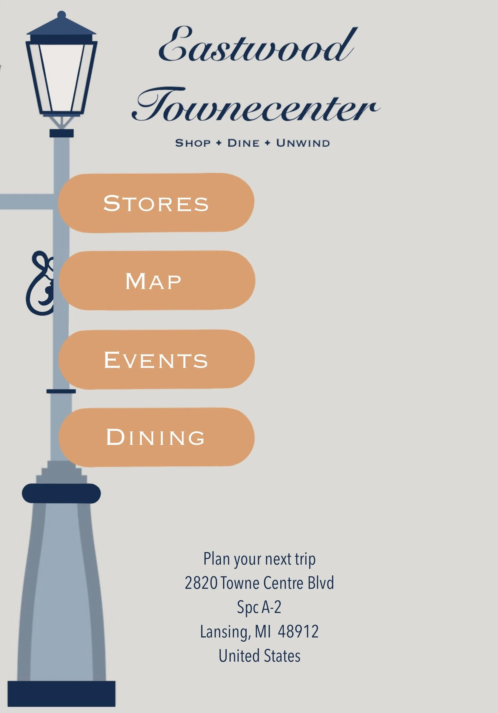
Inspired by the concept of light and light posts, the design creates the illusion of illumination and movement, reinforcing the idea of guidance and direction. The goal of this redesigned system is to enhance the customer journey by delivering a signage experience that is both visually engaging and logically organized.
Concept Statement
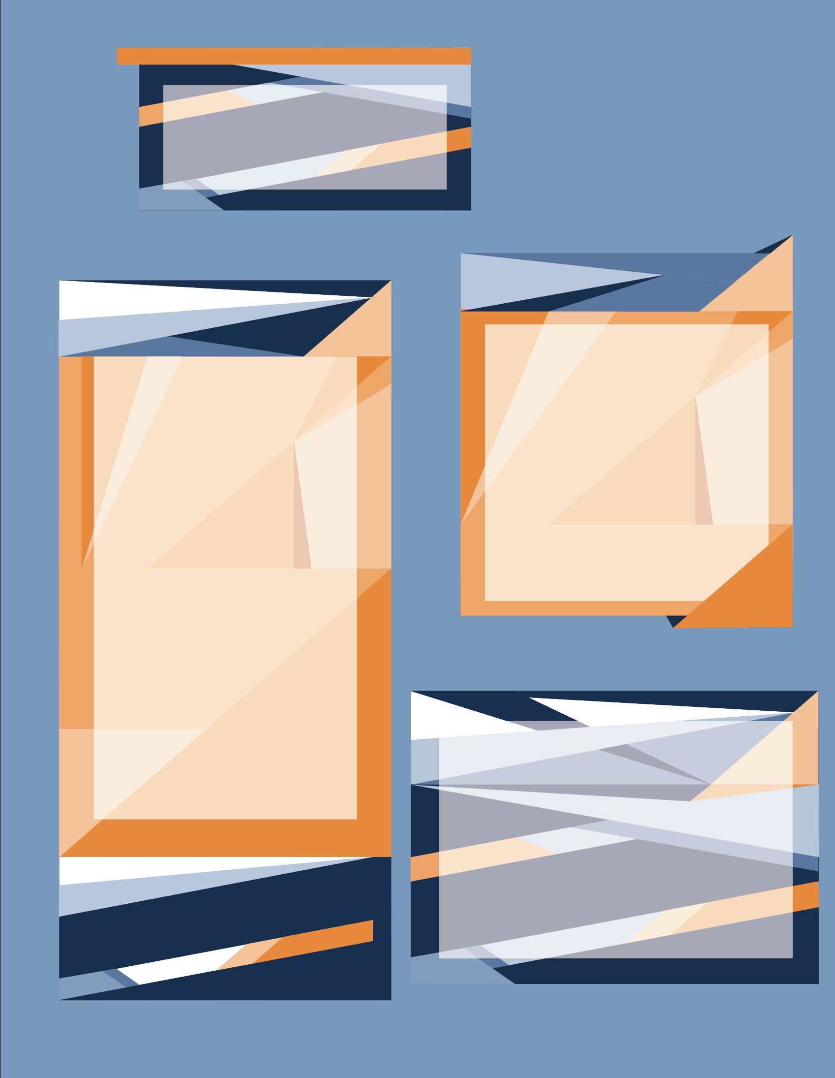
Kit of Parts
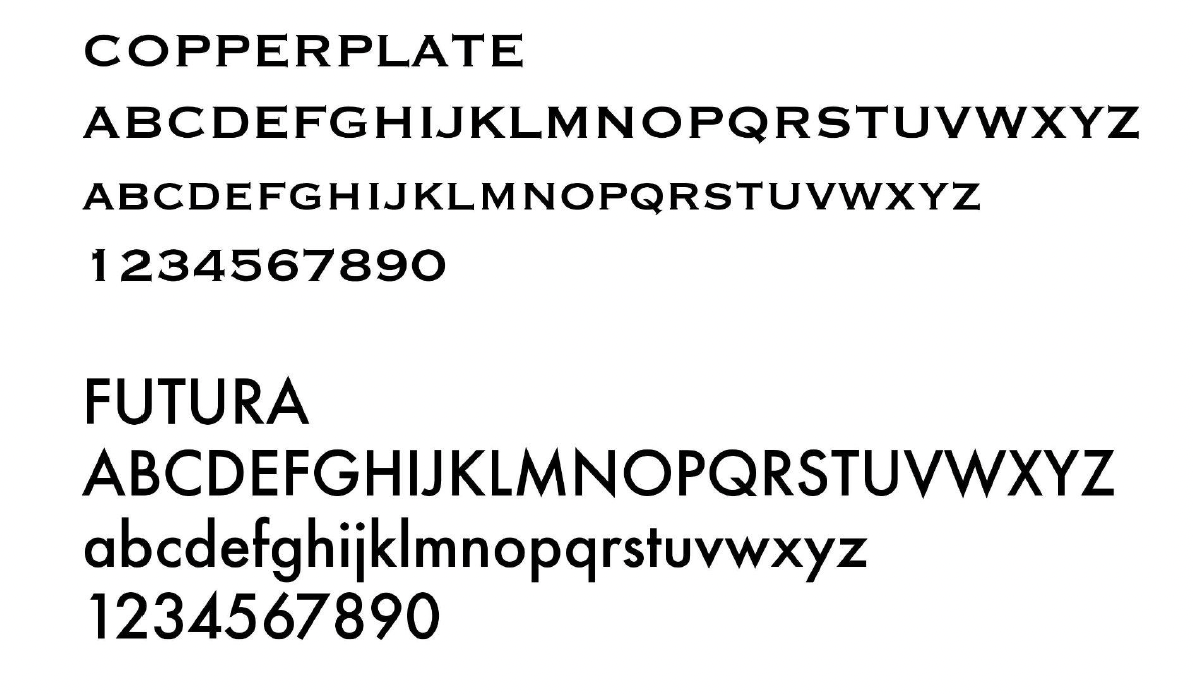
Typeface
For the redesign, I chose Copperplate and Futura to strike a balance between elegance and modernity. Copperplate adds a sense of sophistication and timelessness, aligning with the upscale feel of Eastwood Towne Center, while Futura’s clean, geometric structure supports clarity and modern functionality, ideal for a visually intuitive wayfinding system. Together, they create a cohesive and refined typographic identity.
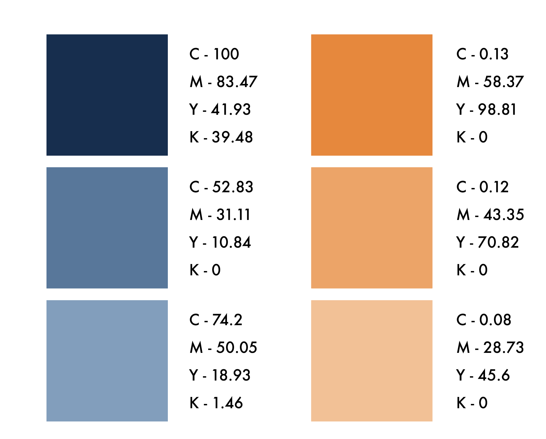
Color Palette
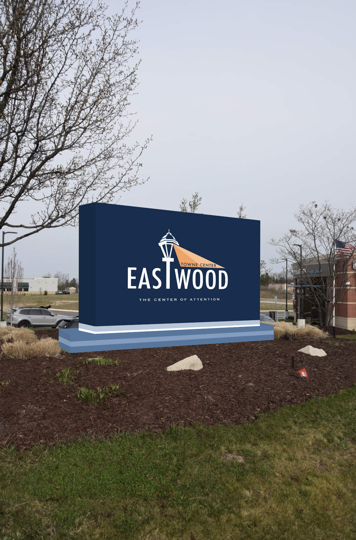
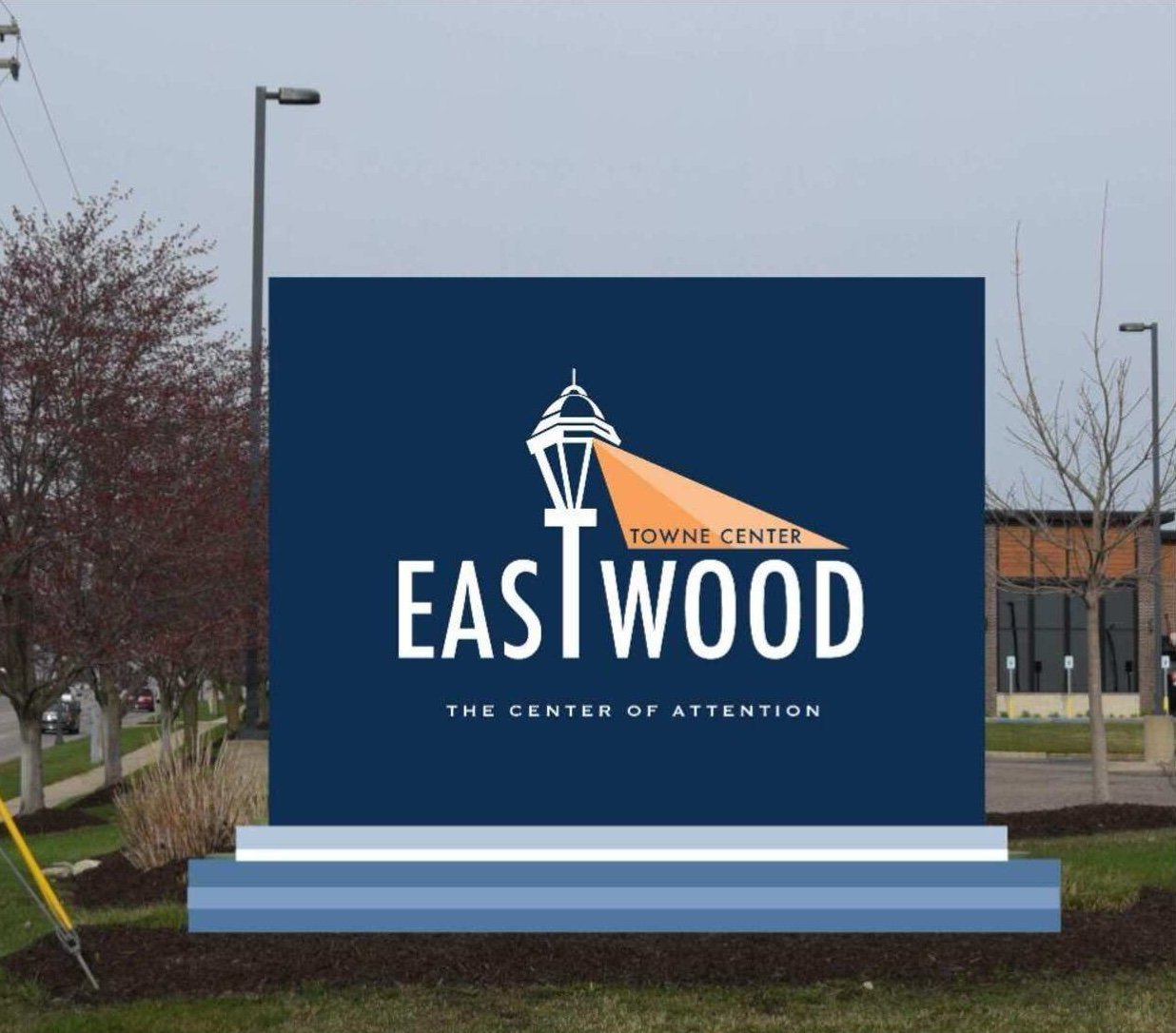
The color palette was updated from green, brown, and orange to a combination of blue, orange, and white to create a more modern, vibrant, and visually clean aesthetic. Blue adds a sense of calm and trust, orange provides energy and warmth, and white brings clarity and balance—together enhancing visibility and improving the overall user experience.
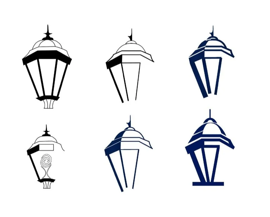
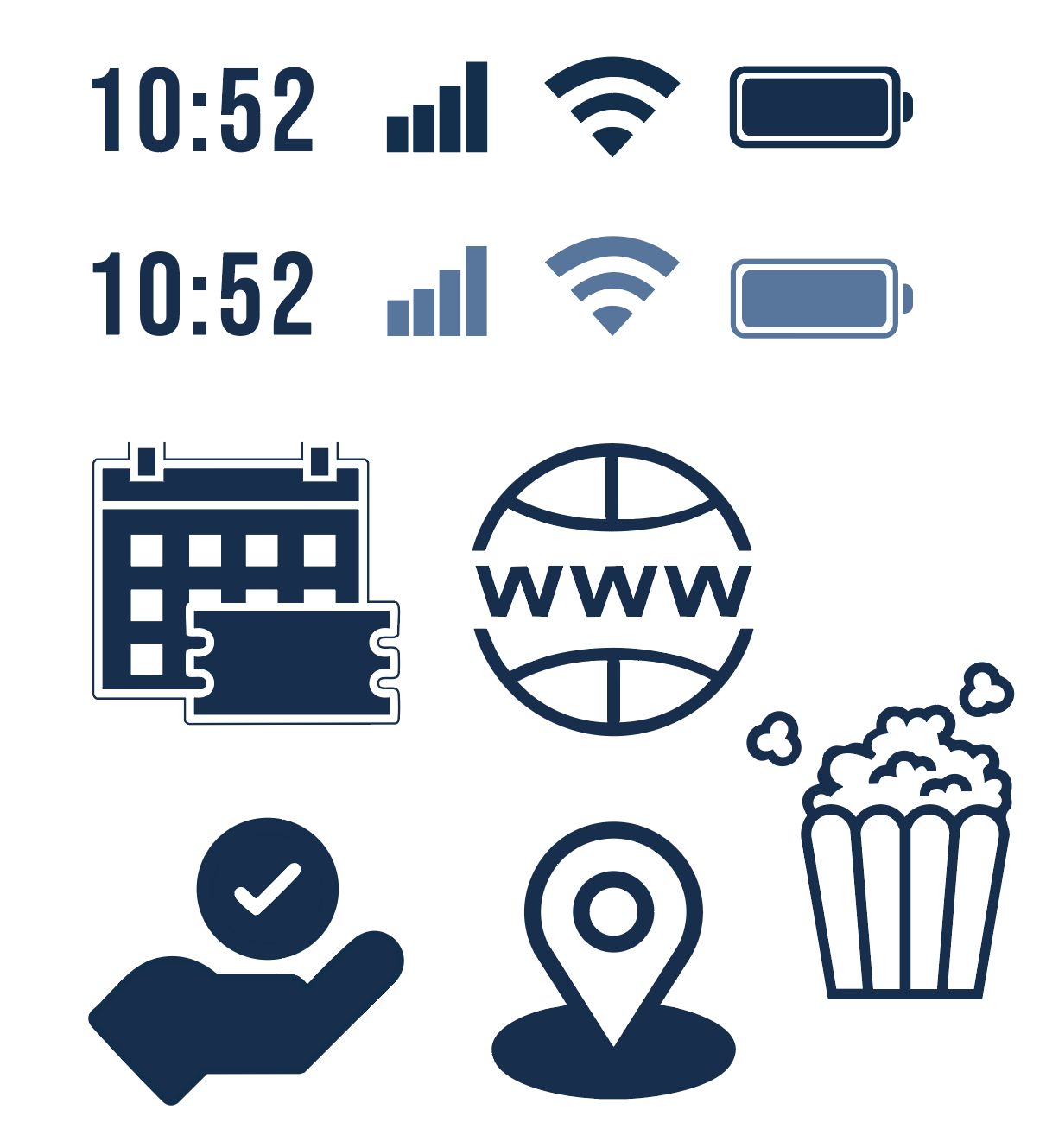
Iconography
During this project, we developed a custom set of iconography through an iterative design process that involved brainstorming, sketching, digital refinement, and visual alignment with the overall brand system. This included careful attention to scale, stroke weight consistency, geometric structure, and visual clarity to ensure each icon was both aesthetically cohesive and easily legible across various sizes and applications. The final icons support intuitive wayfinding and enhance the system's overall visual language.


The development process played a crucial role in shaping the outcome of this project. By documenting both physical and digital sketches alongside reference photos of the existing system, we were able to deeply analyze what worked, what didn’t, and where creative opportunities existed. This methodical approach allowed for greater exploration, critical thinking, and iterative design, pushing the concept beyond surface-level solutions. Taking the time to engage in each step of the process enabled more thoughtful edits, refinements, and design decisions that may not have emerged without this structured and reflective workflow.
Development Process
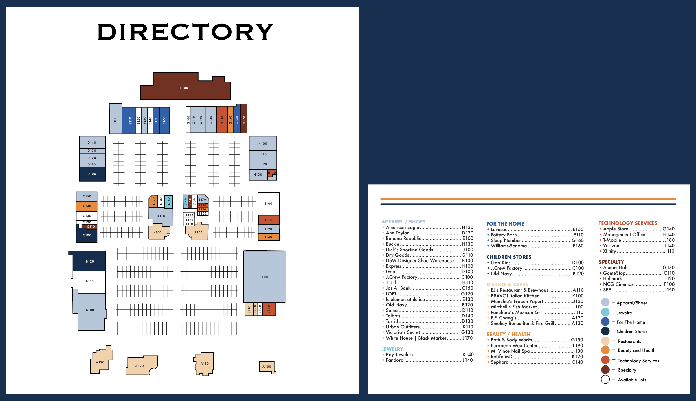
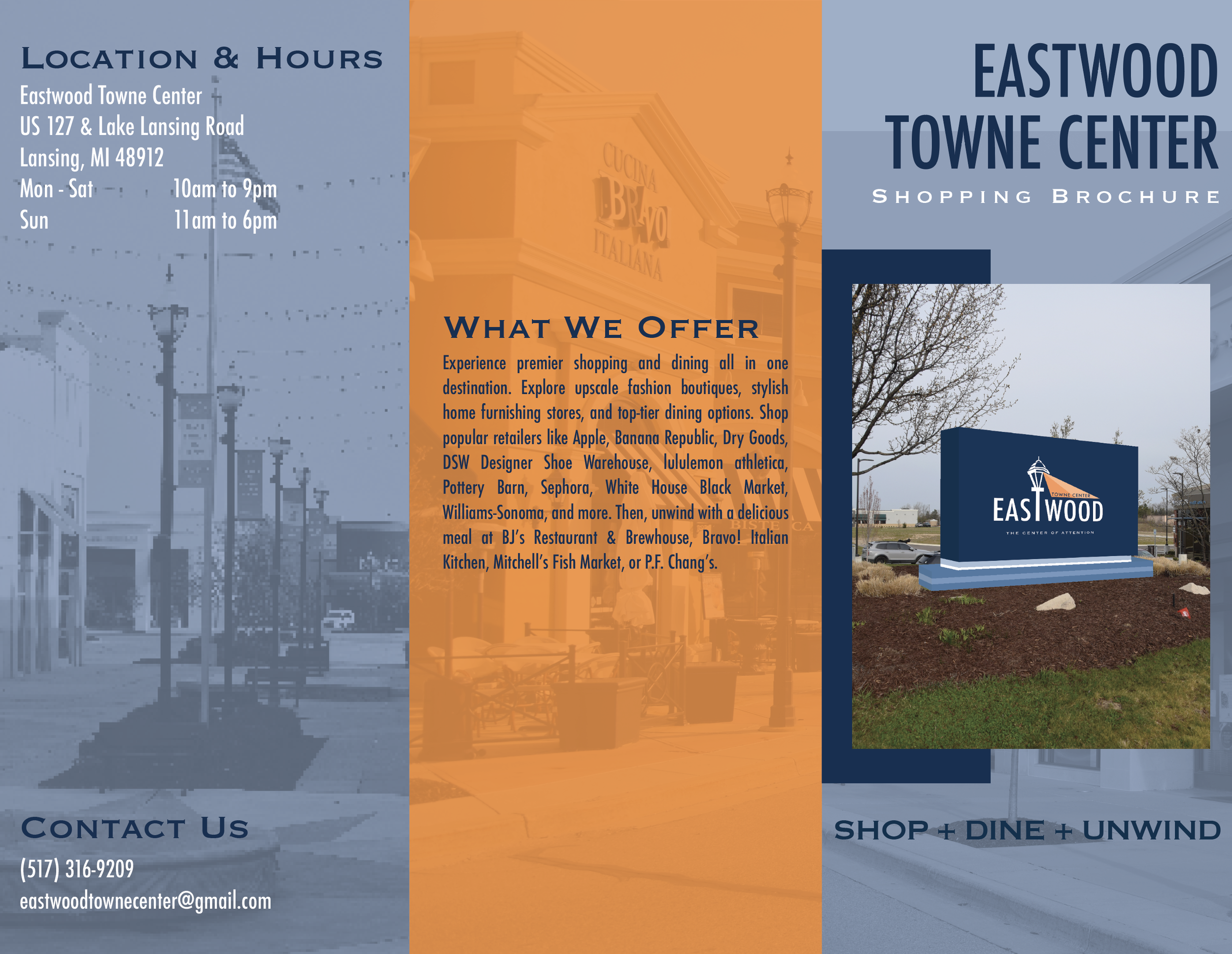
The finalized design elements represent a cohesive and fully developed visual system that builds on the exploratory and iterative phases of the project. This collection includes a custom logo, iconography set, and high-fidelity digital renderings of key signage components such as retail storefront signs, banners, restroom signs, a pylon sign, and scale representations for context. Supporting graphics include a detailed map and directory design, a mobile navigation mockup with integrated icons, and an informative brochure. While these elements are not yet implemented in physical space, they demonstrate a unified and functional design system ready for real-world application.
Elements of the Design System
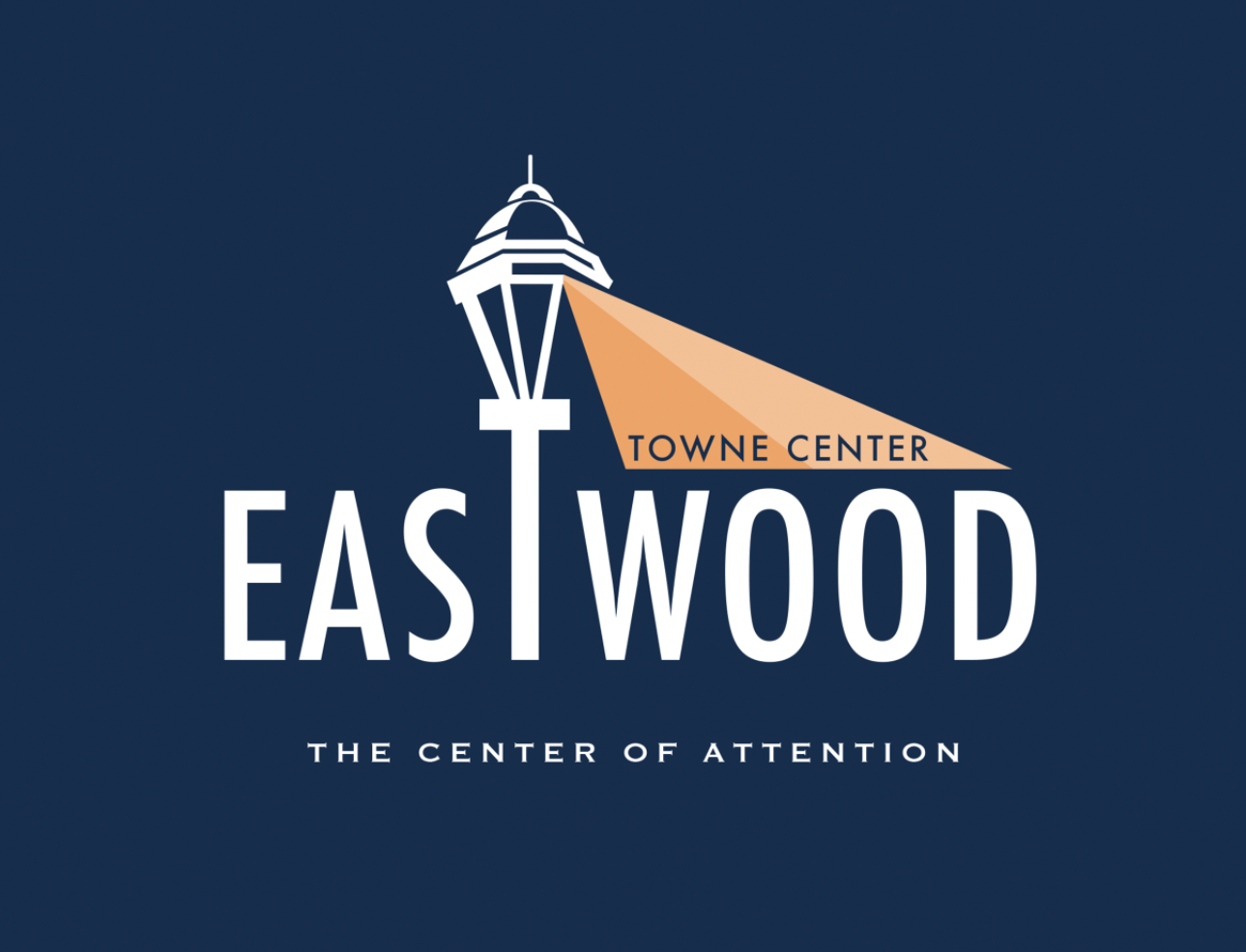
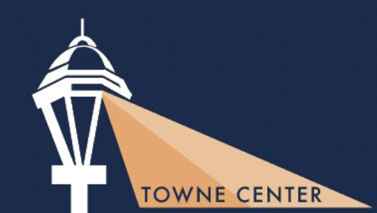
Logo
Icon
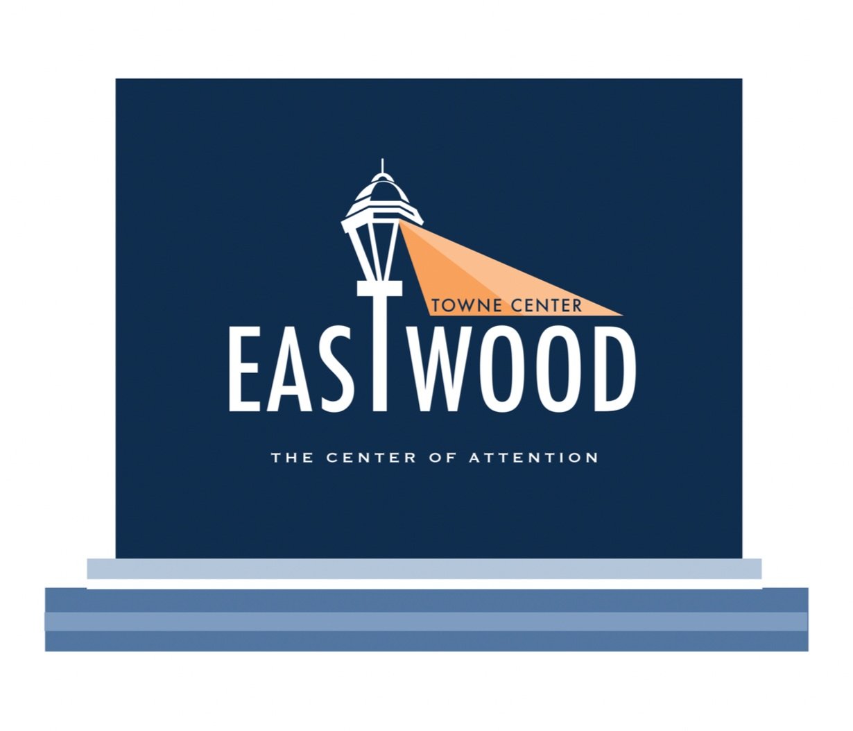
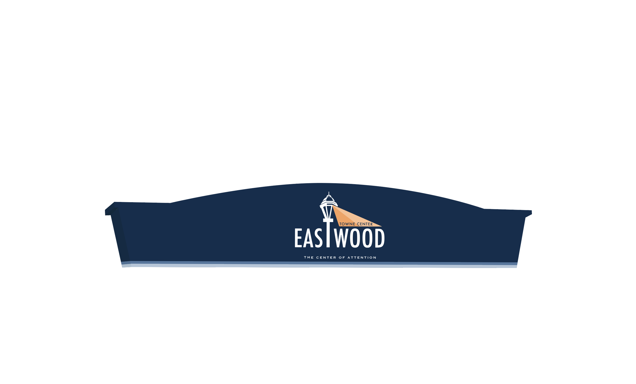
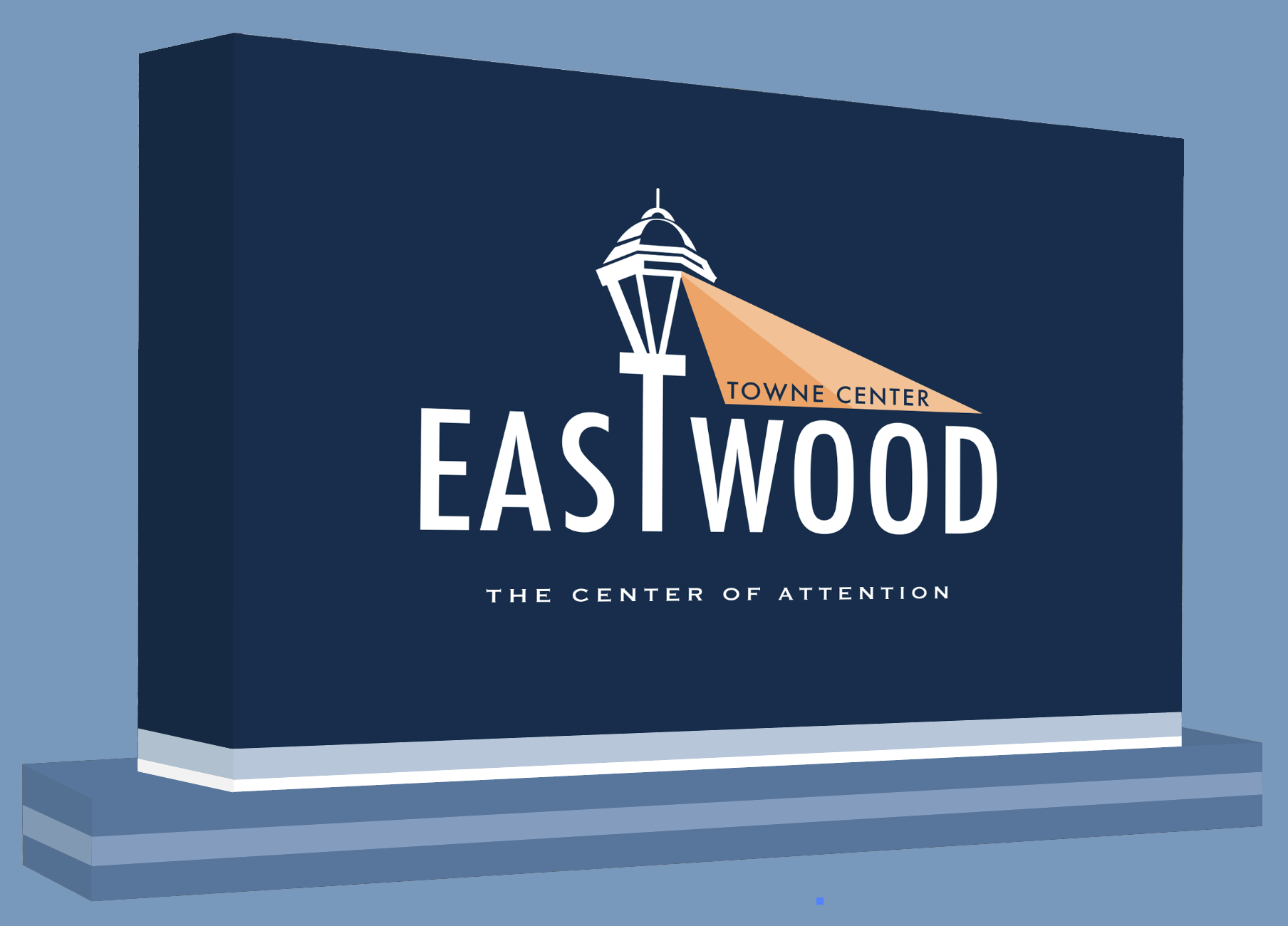
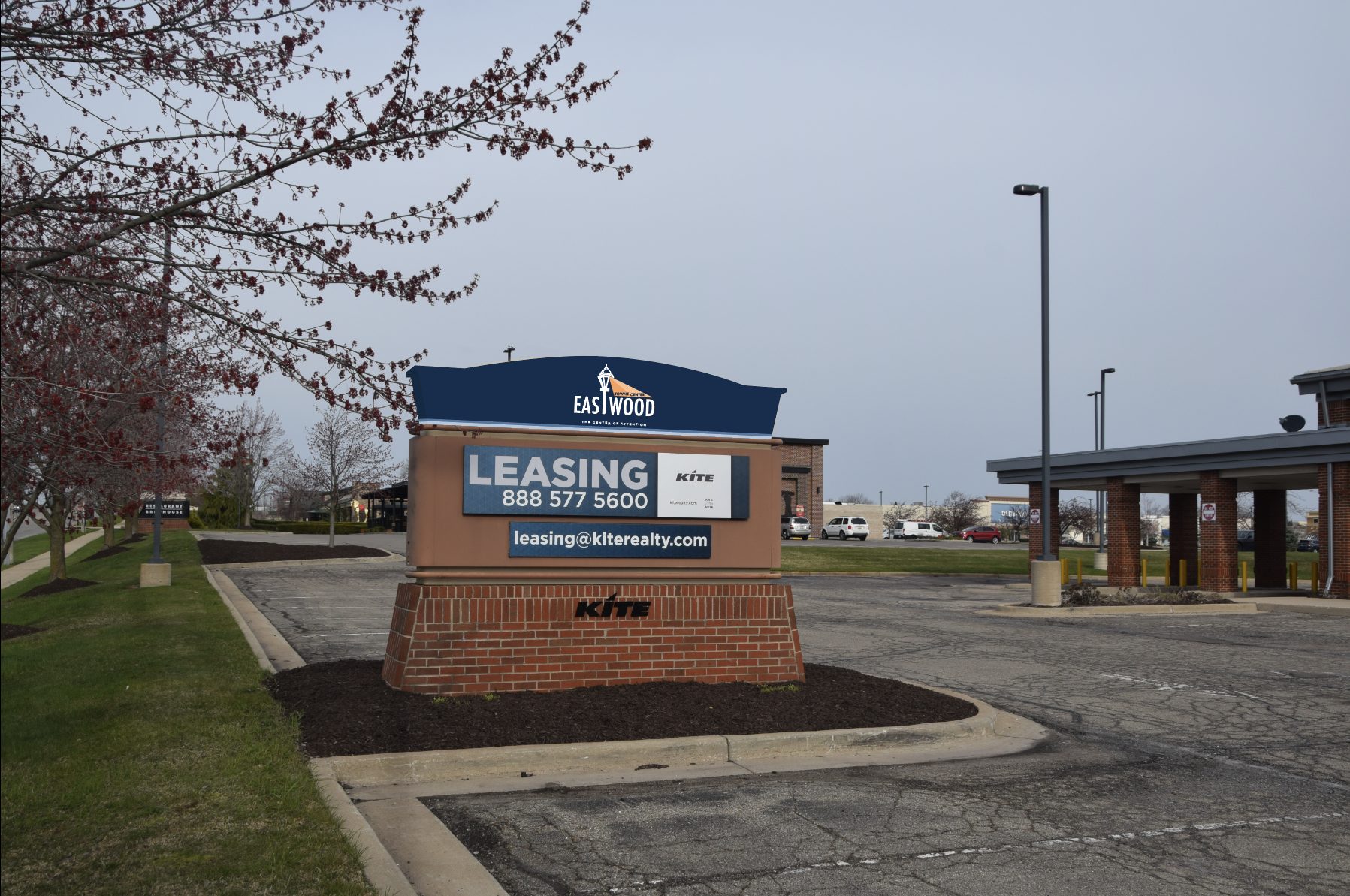
Pylon Signs
Store/Retail Sign
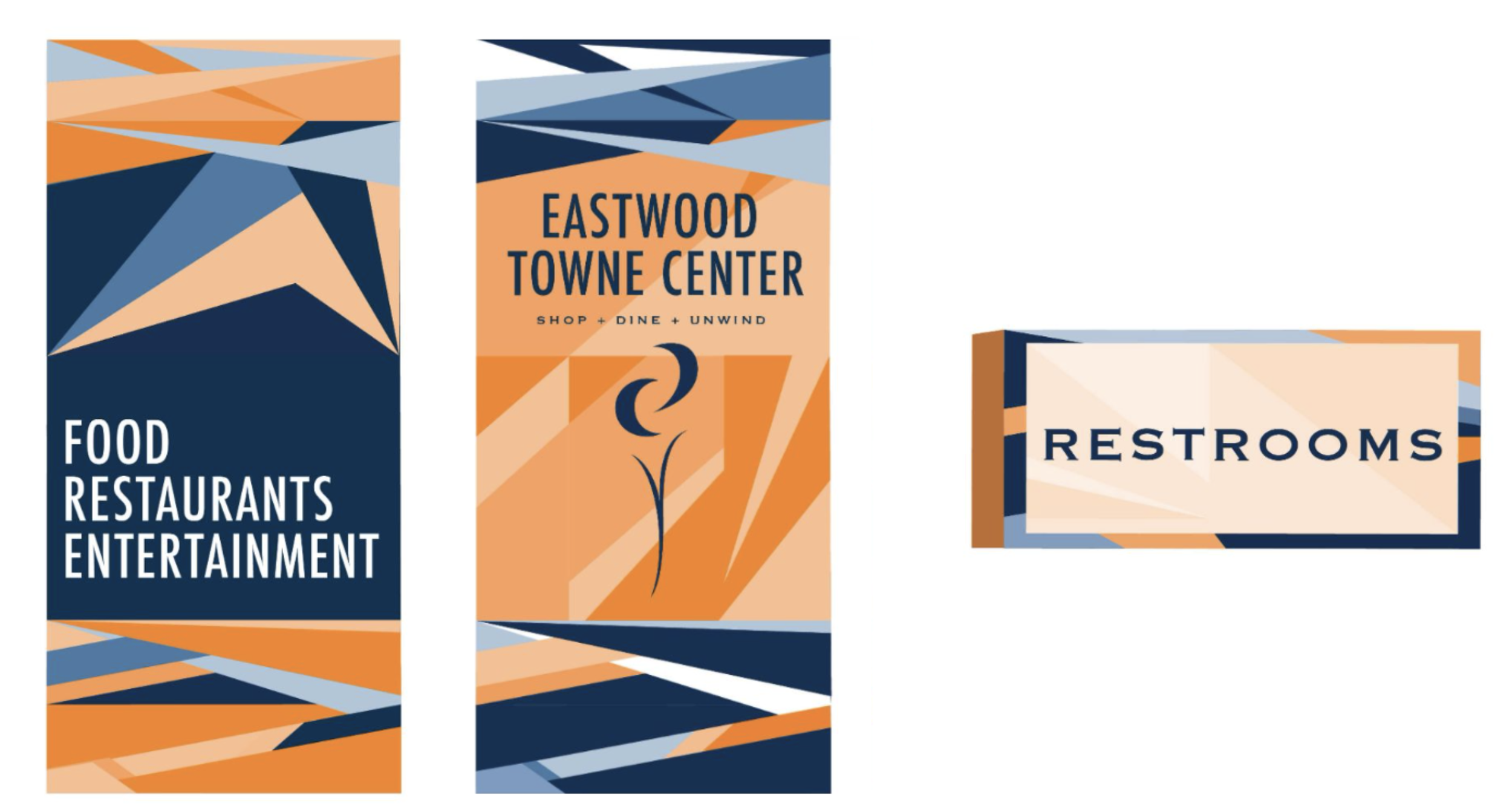
Banner & Restroom Sign
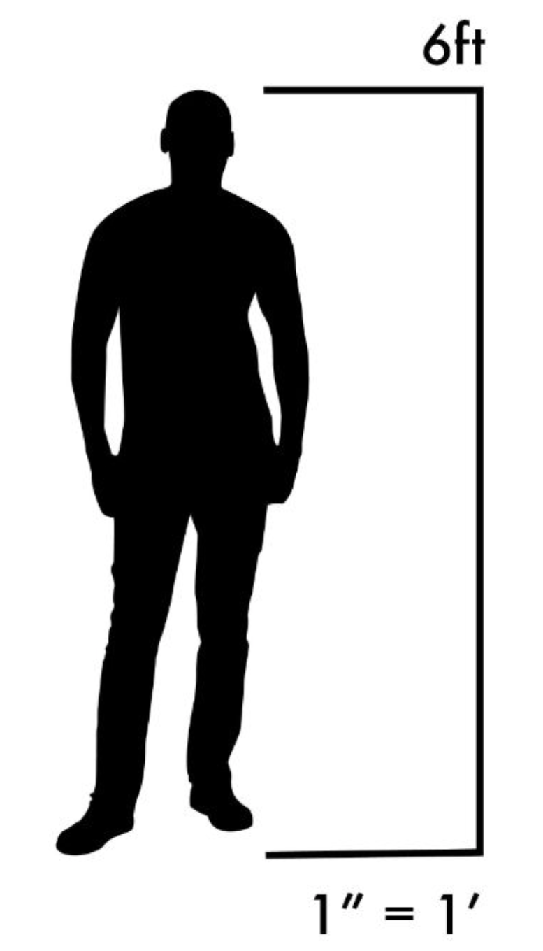
Scale Representation
Signage Graphics
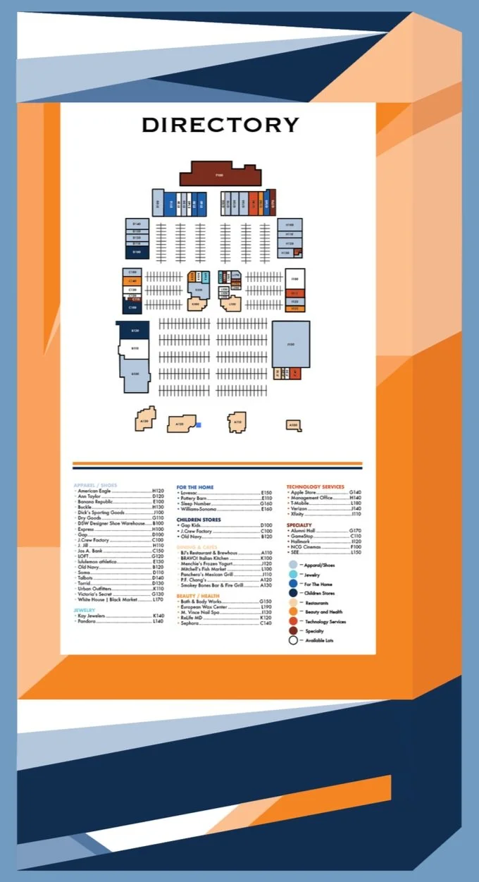
Map & Dictionary
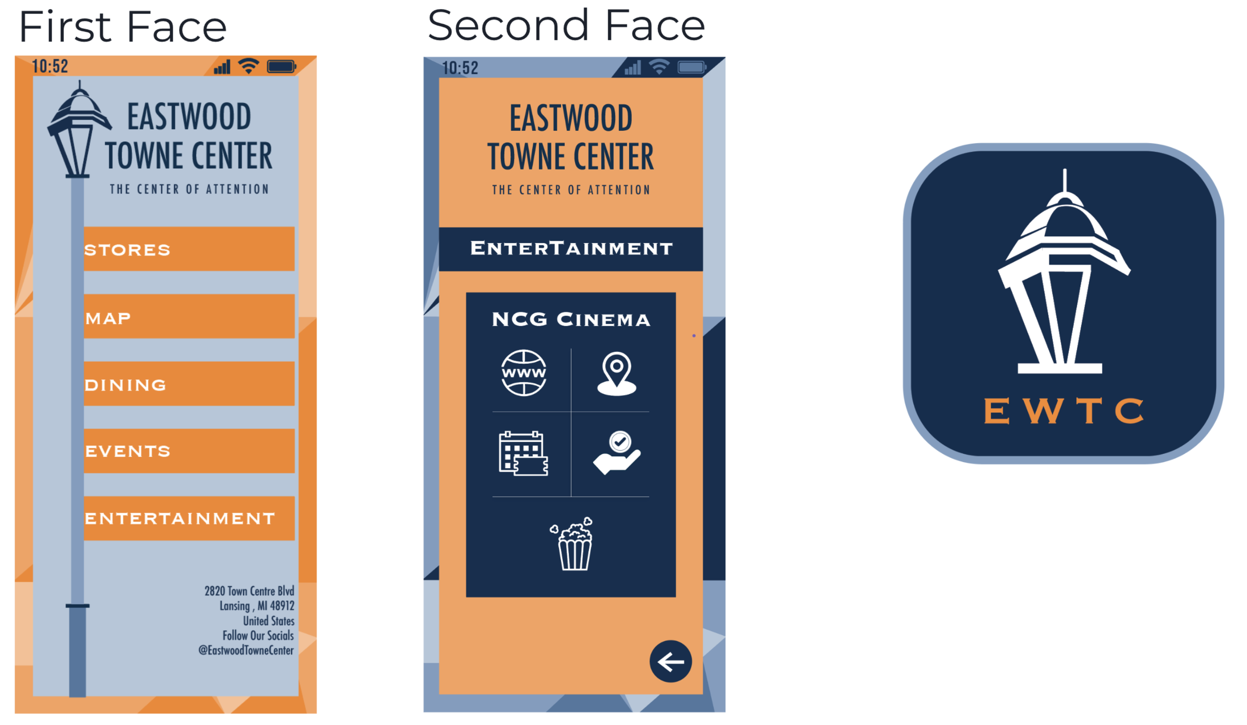
Mobile Navigation Resource & Icon
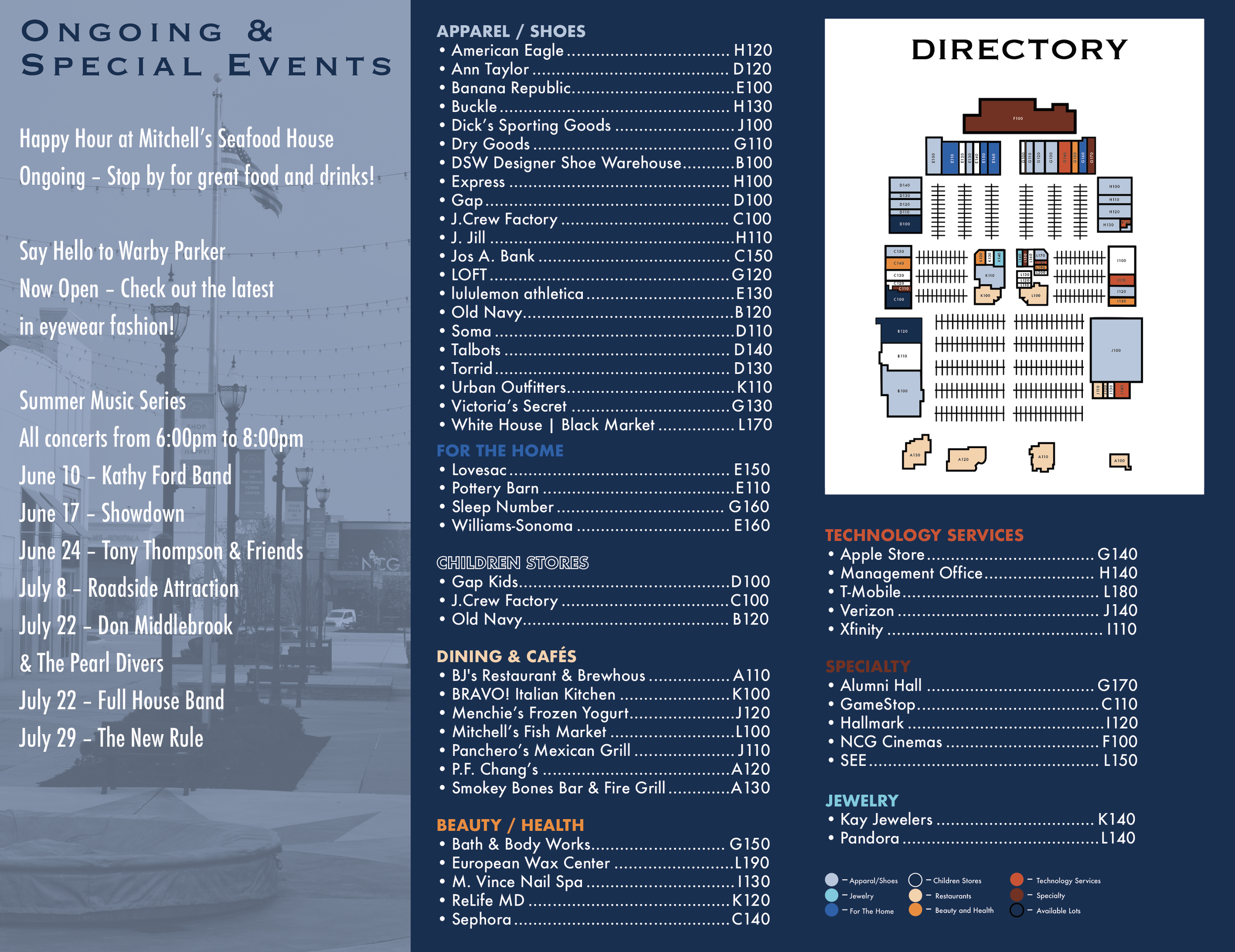
Informative Brochure
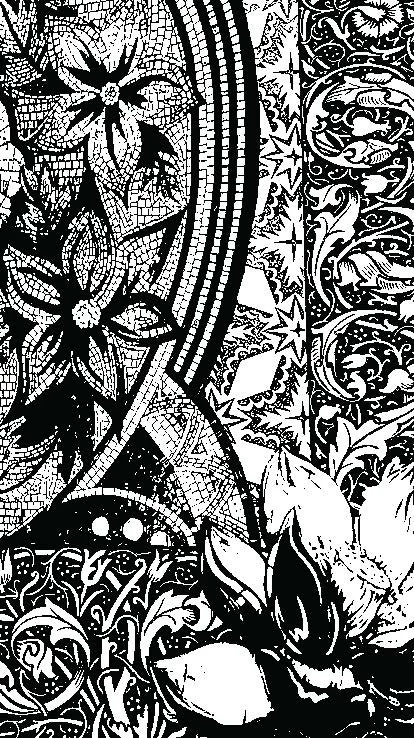
Line & Illustration
The first set of illustrations, developed in Etching 335 and Screen Printing 1, highlights the integration of line, shape, and other core elements of art. Their expressive quality and compositional balance make them a strong contribution to this collection.
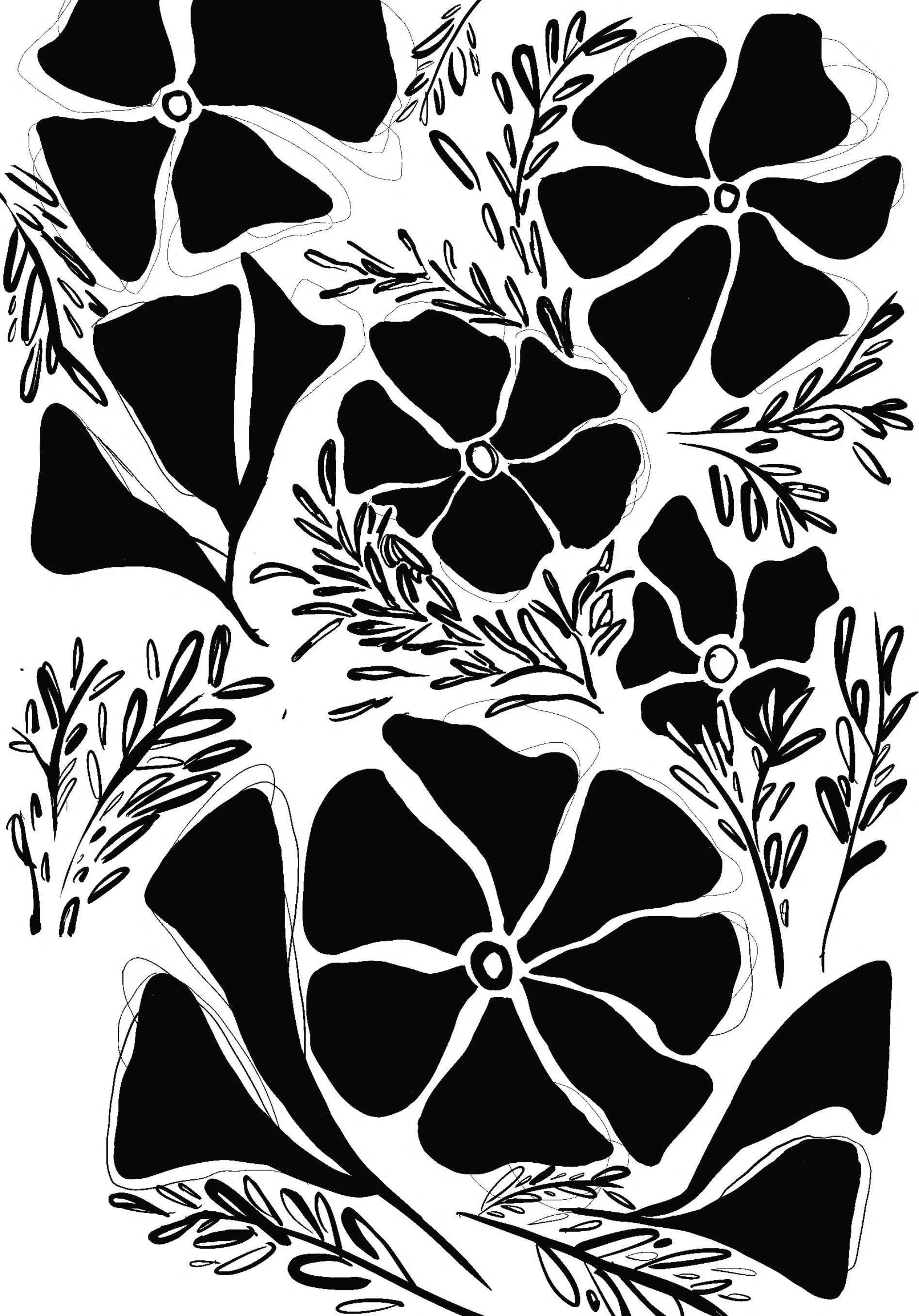
The second set of images consists of digital renderings created for an etching course taken in Fall 2024. This series explores the relationship between line and shape, which I felt was best represented through these compositions.